

Walmart E-commerce
Overview
Walmart, the world's largest discount retailer, offers an assortment of +1m items to customers across the globe. This large variety of items helps Walmart meet the needs of a diverse population but also poses challenges in helping customers find the right item for them while shopping online.
As a senior designer on the Search and browse team I worked to create an easy finding experience that understands
and anticipates customers needs to help them find what they want, while saving them time and money.
Problem statement
Walmart, traditionally known for their brick and mortar offerings in over 6000 stores, had been slow to pivot to today's online shopping landscape. The urgency to bring a competitive e-commerce platform to market resulted in a site with
a cumbersome finding experience. Customers were bombarded with irrelevant items, struggled to find their exact product match, and had trouble using search refinement tools.
Audience
This project focused on Walmart’s primary customer segments:
Time Sensitive Busy Families
Very budget-conscious while also super time-sensitive
Actively seeking new ways to make their $ and minute go further
Care about trends and brands and seek to project a quality lifestyle
Budget Sensitive
Busy Families Super budget-conscious and cost-focused
Need the lowest prices
Less willing to shop around
Shop discount retailers and OPP product to save money and time
Roles and responsibilities
As a member of the Search and Browse team I worked with 2 fellow designers, 2 design managers, 2 designer researchers, 1 content strategist and 4 product managers on the overall strategy and vision for Finding. I led design efforts in the areas of Search disambiguation aka “stacked recall” and Personalized Search while contributing to other areas of focus including predictive type, filtering and product suggestion.
Process
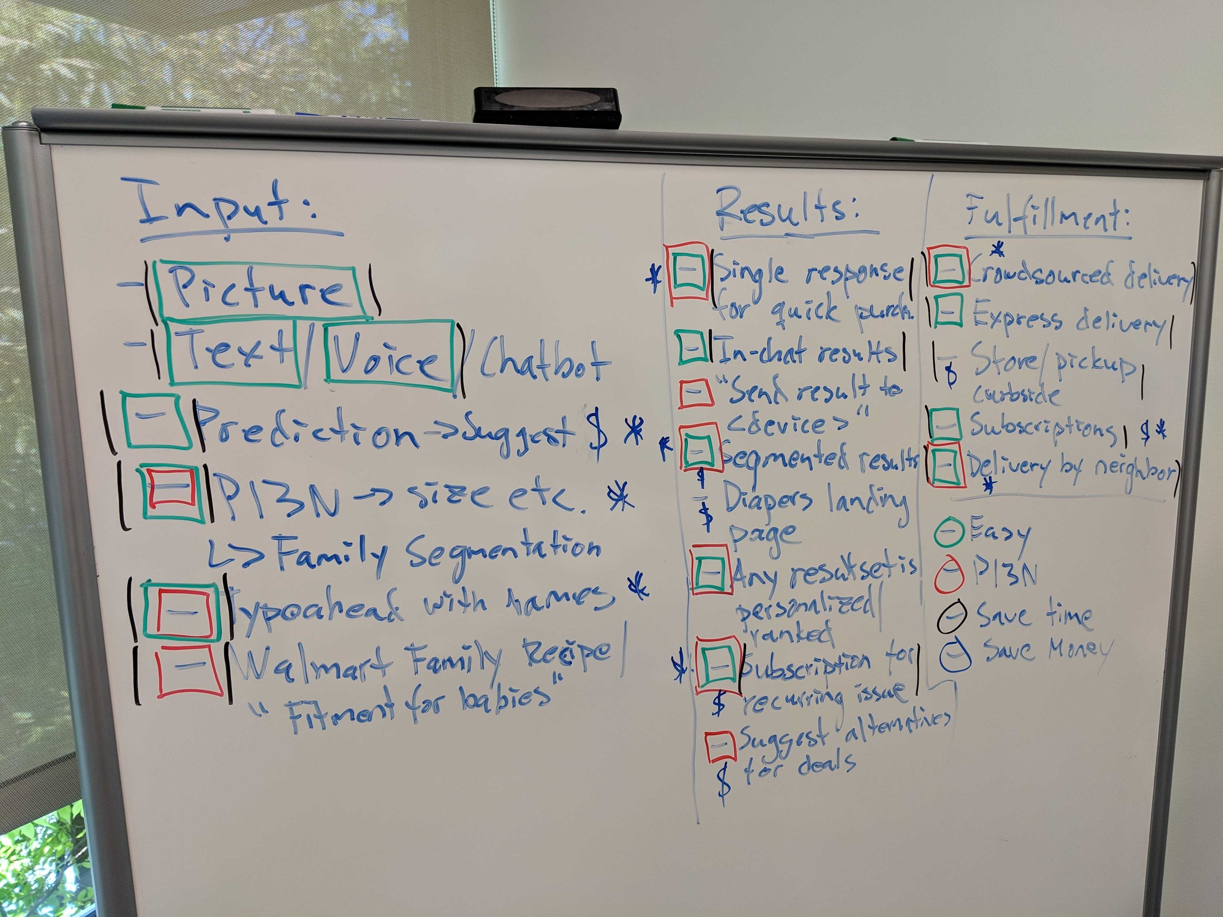
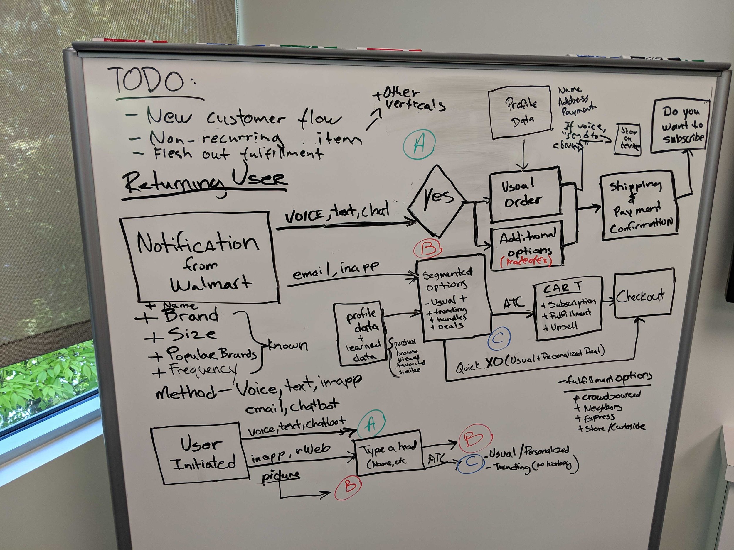
At the onset of the project product leaders triangulated data from VOC (voice of customer), verticals and Search BE to better understand the problem. We then began having cross-functional brainstorming sessions. The goal of the sessions were to brainstorm ways to create an easy, personalized shopping journey that saves customers time and money. From that session we came away with user journeys and features that we hypothesized would help new and returning users when conducting Broad (general) and narrow(specific) searches.
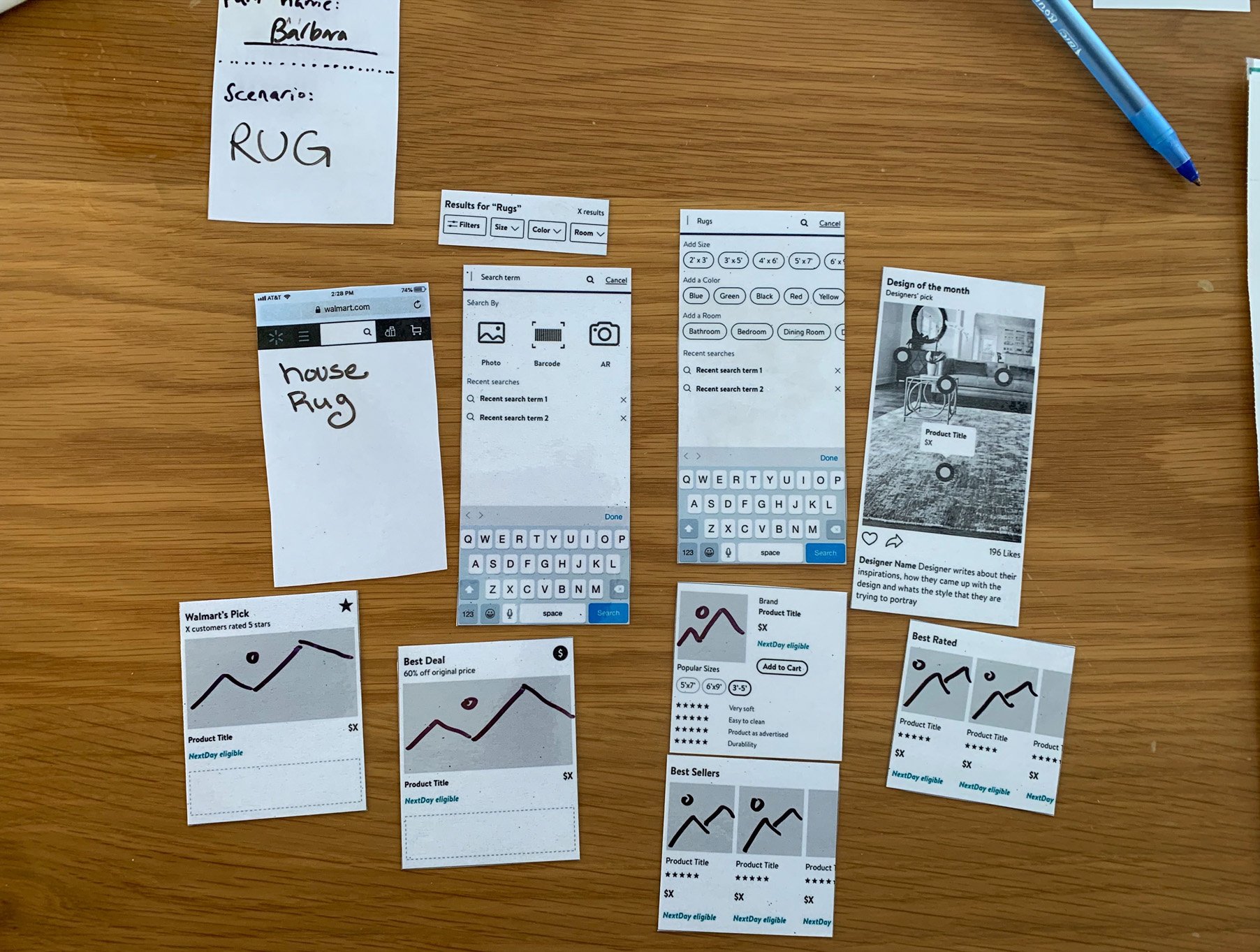
Following the workshop I worked with our product partners and researcher to test our hypothesis with customers. Referencing the “Top 200k search queries” on Walmart, I selected items that exemplified popular Broad and Narrow searches and created shopping narratives around them, using the features we wanted to test. I converted those narratives into storyboards for our researcher to use to conduct a Storyboard Study.
Our study had 4 primary goals in mind:
Understand which experiences resonate with customers and why
Understand the types of features that users connect to
Identify opportunities for different types of features
Better understand if certain features are more useful in specific situations
Our storyboards put several features in front of our users with category disambiguation “stacked recall” and Smart filter questions as you browse “interstitial filters” proving to resonate the most. With the findings from the storyboard study
we began to move forward with design explorations prioritizing these recommended features.


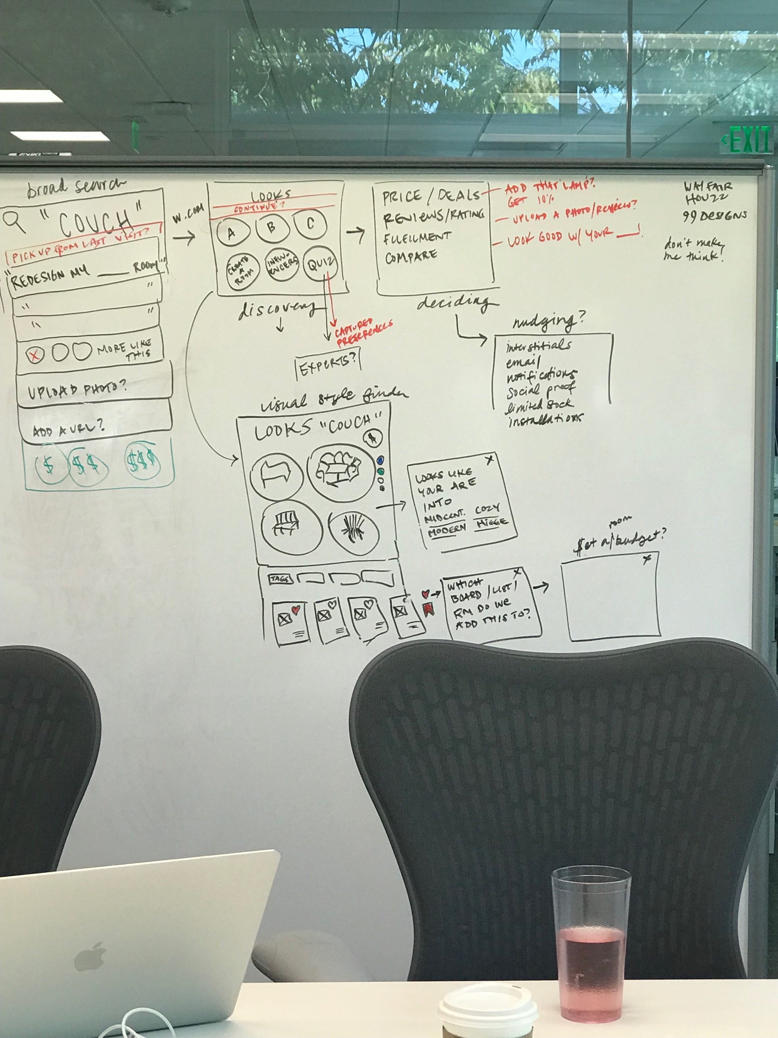
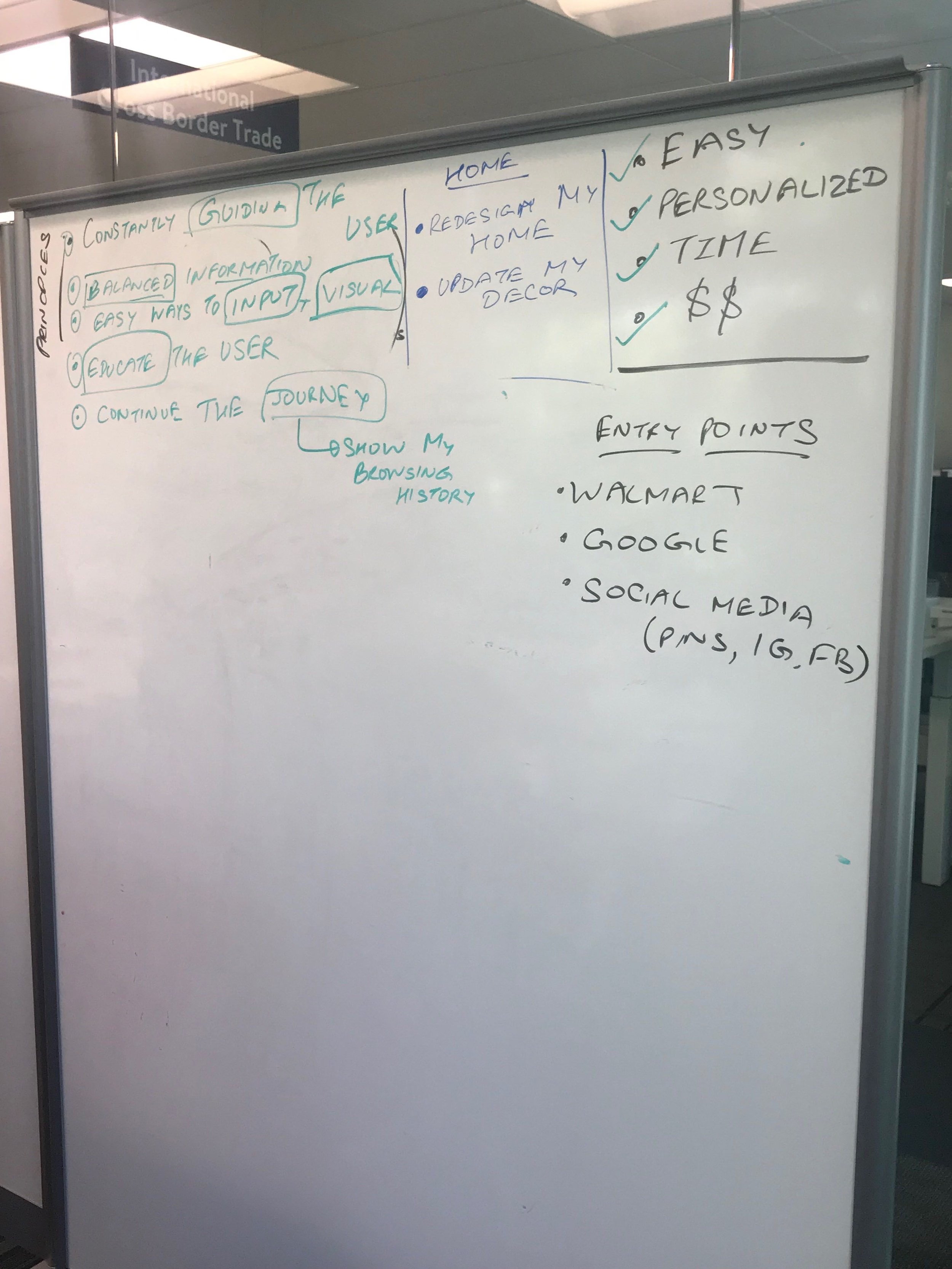
Over the next few months myself and the 2 other members of the search team did a wide range of design explorations of what a search results page could look like, with a focus on the features that came out of the storyboard study. Other features and filtering options also entered into the exploration as we continued to work with our product partners and conferred with multiple category specialists. I explored through multiple lenses, new customers vs return customers, broad searches ( Brand or subject ) vs narrow searches (subject, brand and attribute), High consideration items vs low consideration, and spec driven vs image driven items. I also explored in three different flavors one staying close to the existing Walmart Living Design design language, one venturing far out and another that landed somewhere in-between.
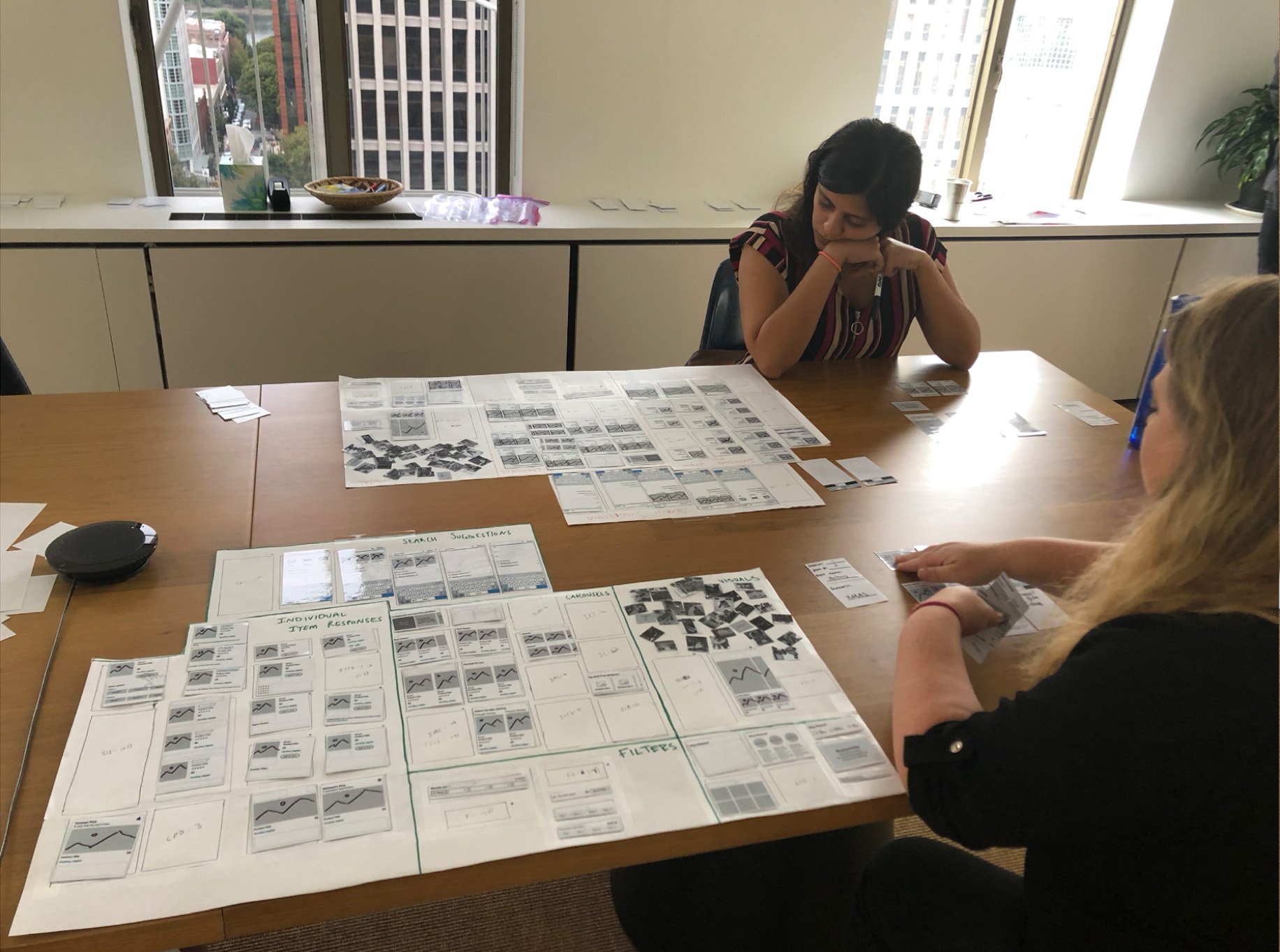
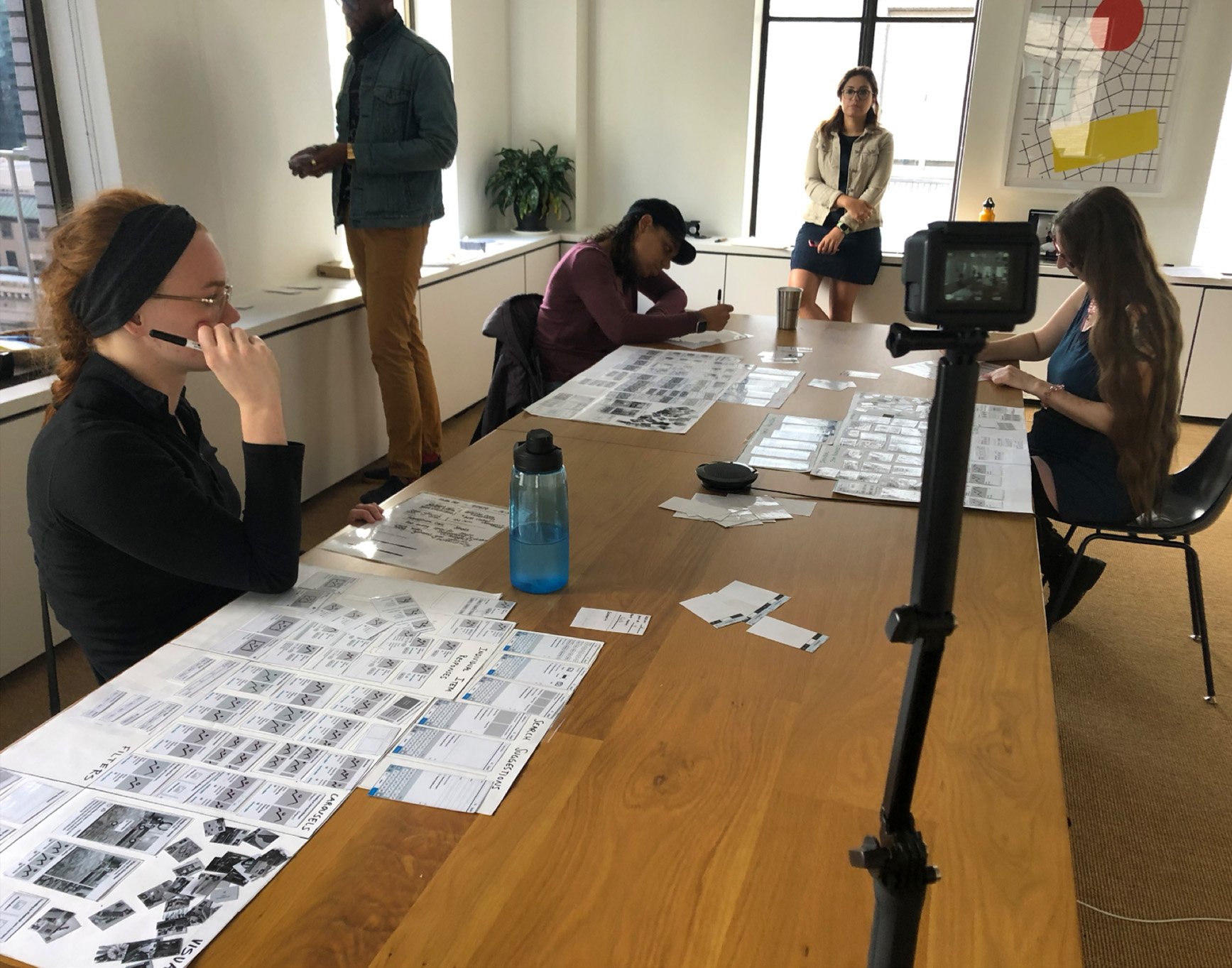
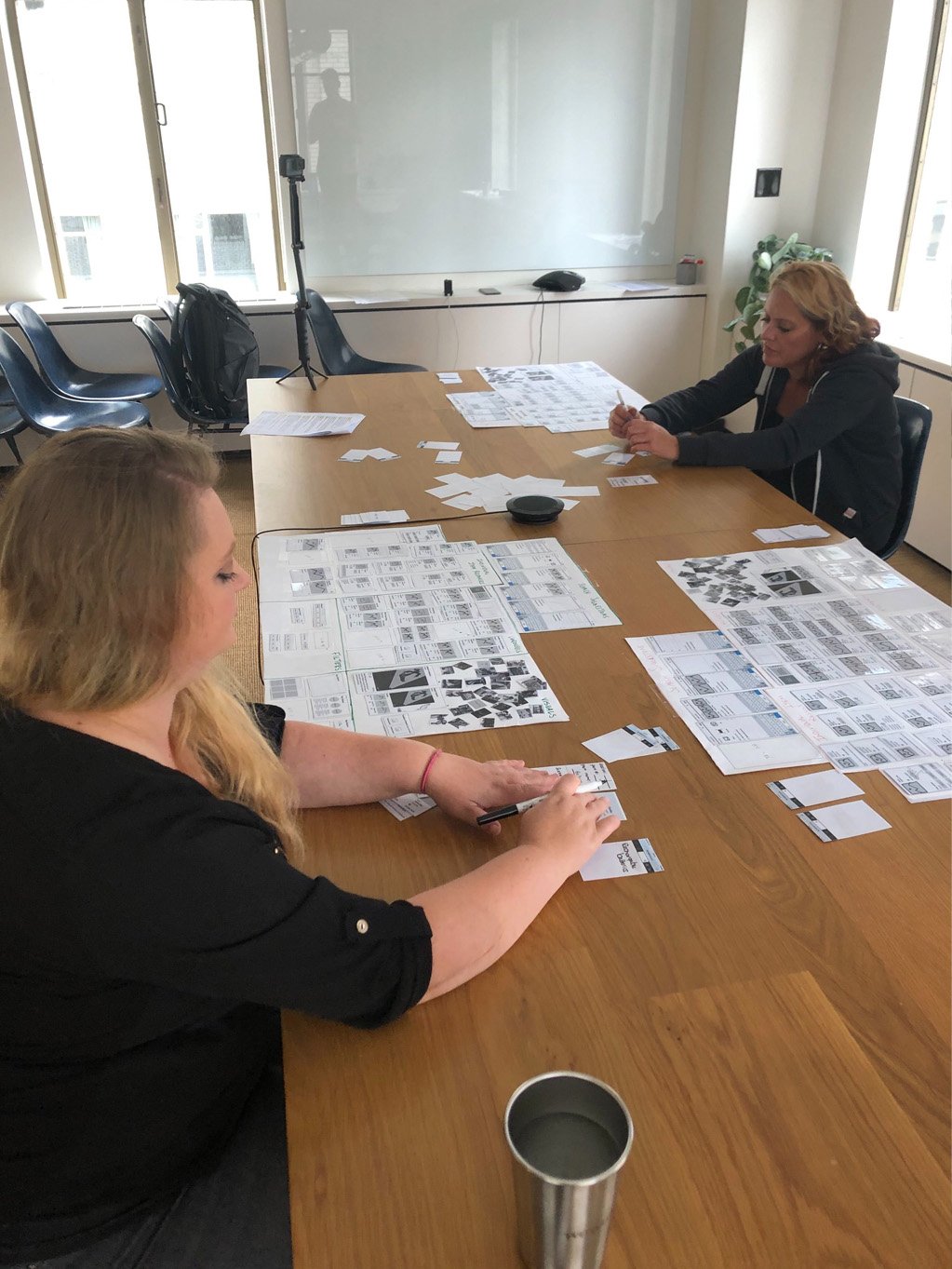
Partnering with our researcher we decided that a co-creation study was the best way to achieve that.
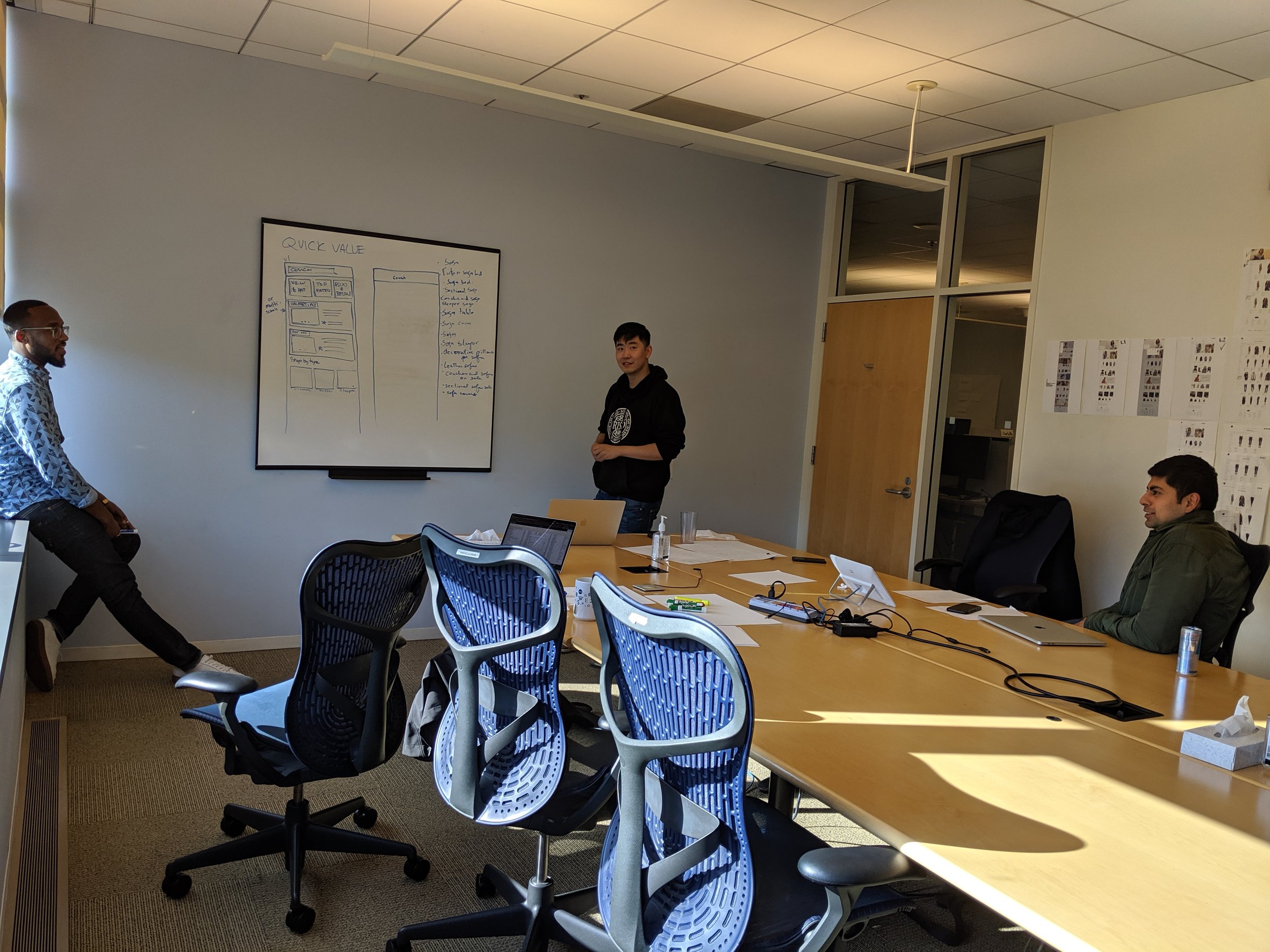
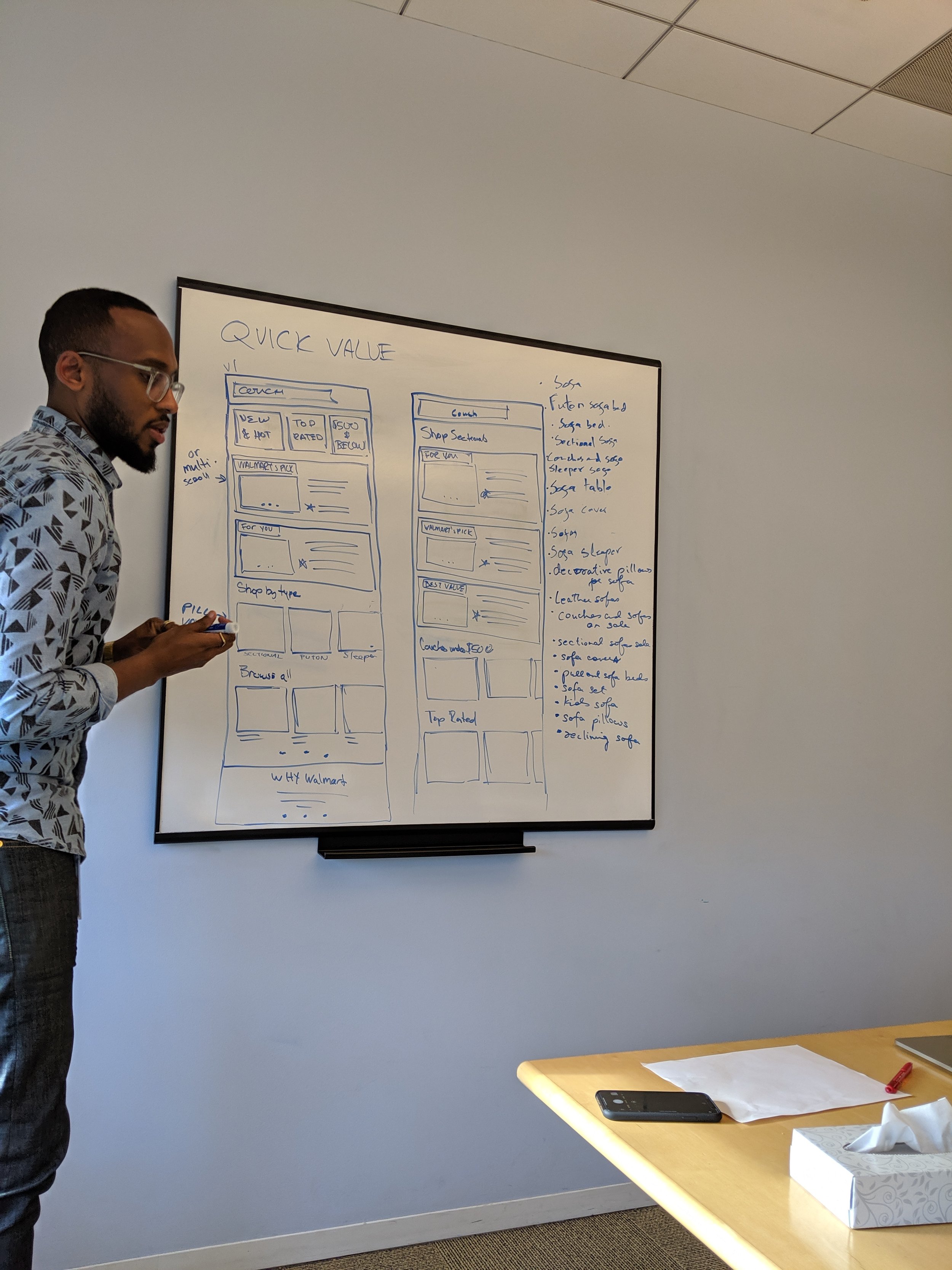
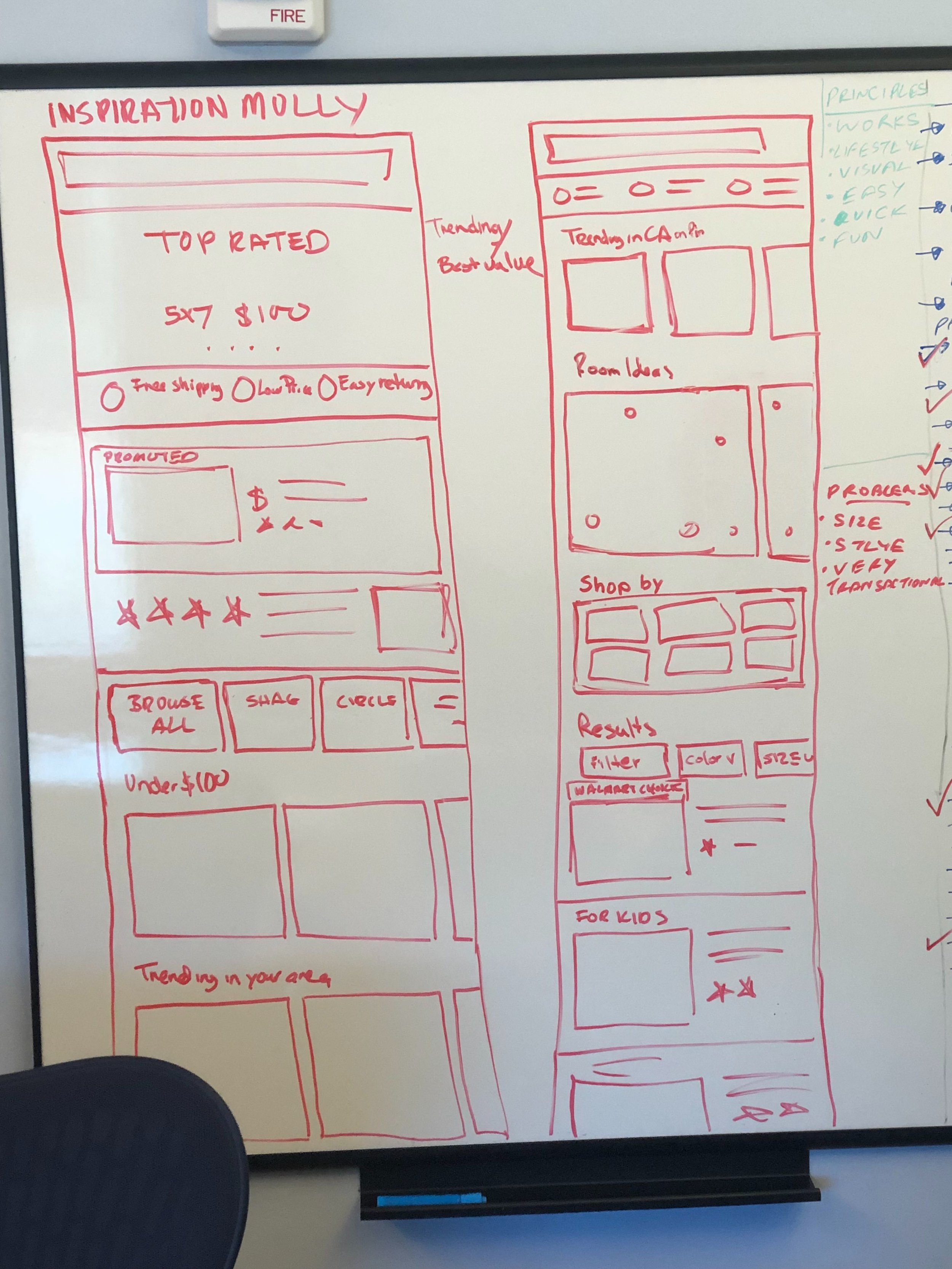
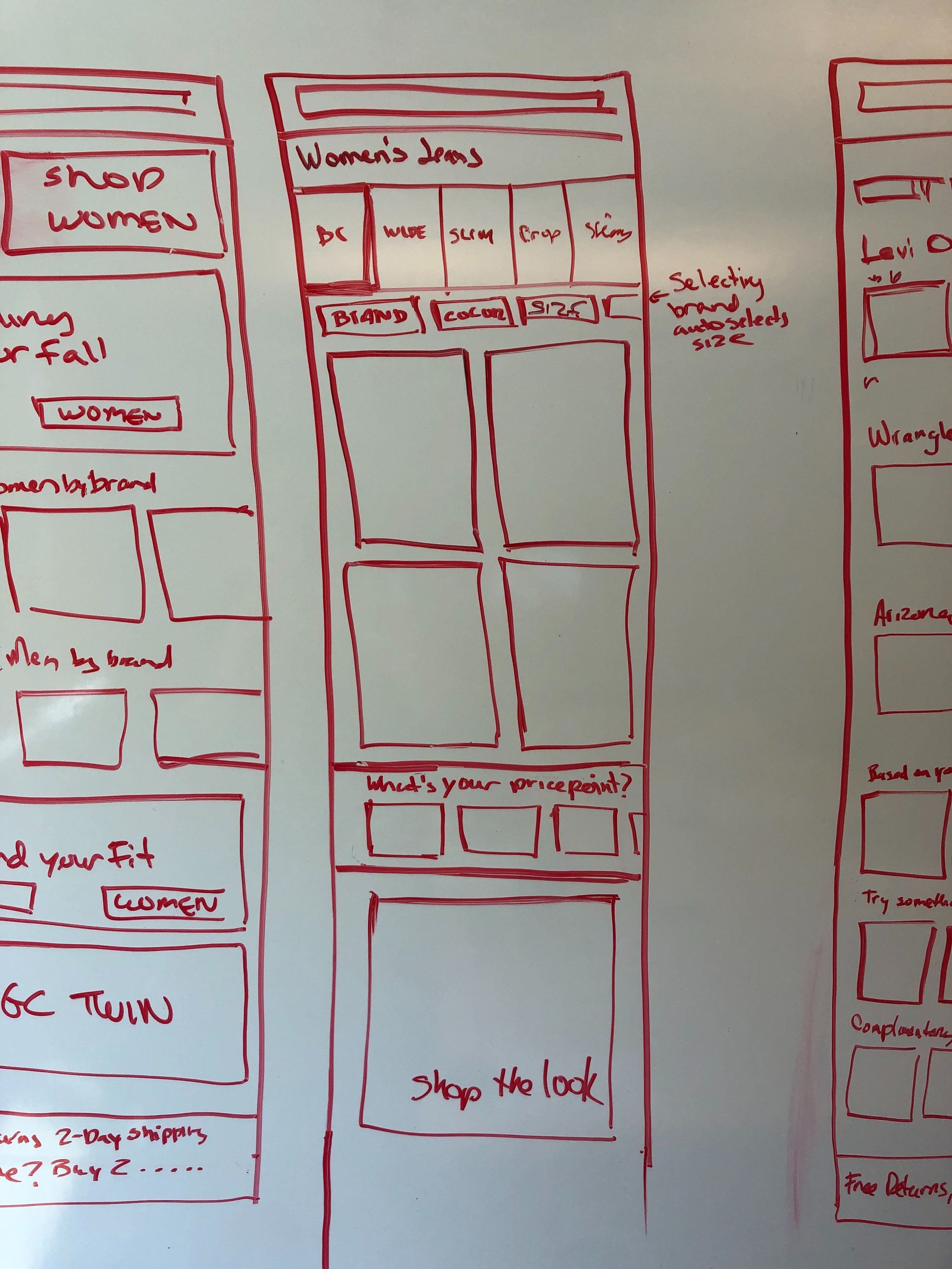
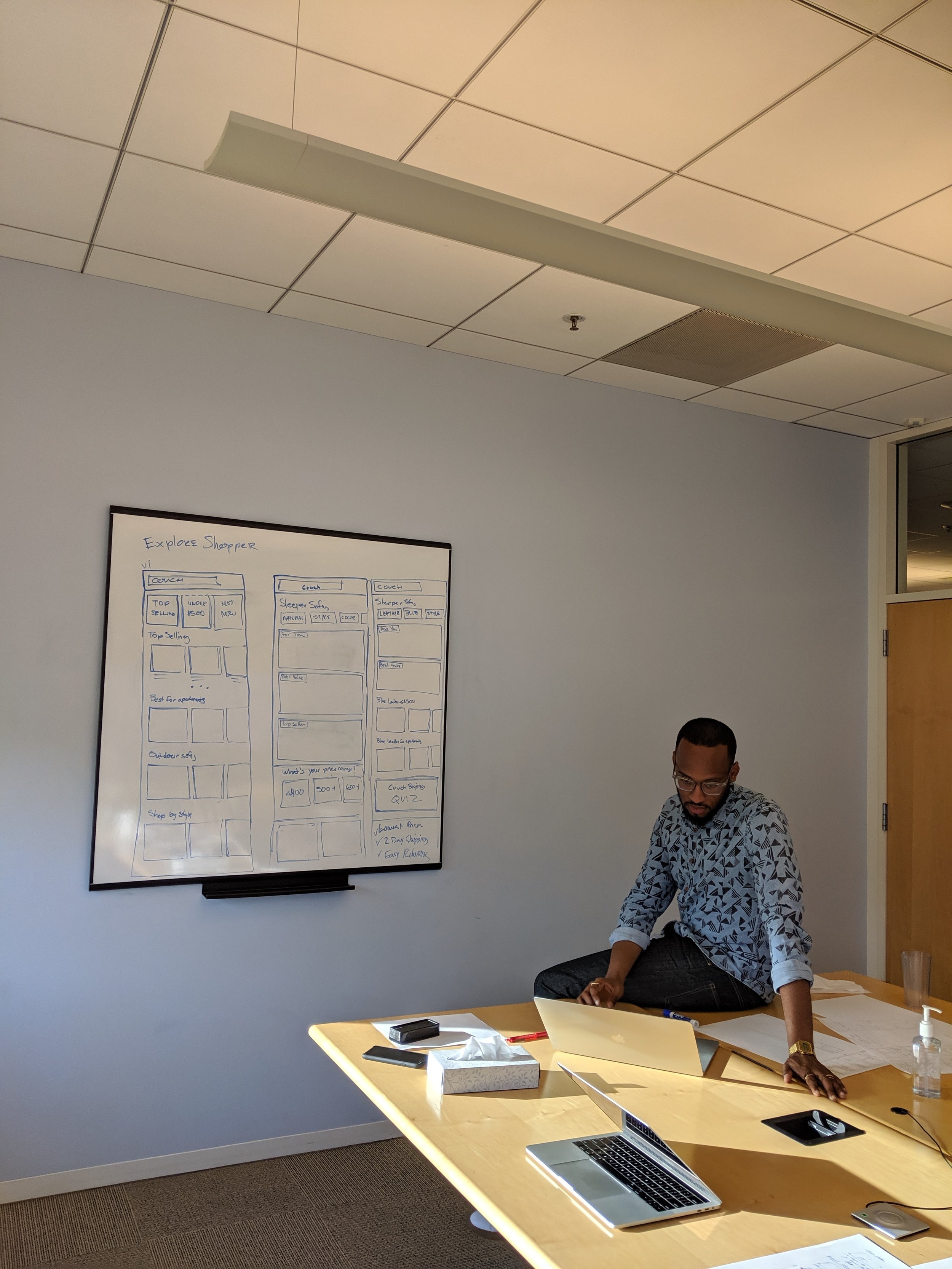
Module exploration
Co-creation study
In the study the researcher walked participants through different shopping scenarios that pertain to our customer missions and journeys and asked them to use the modules the design team has already created to build PLP screens that would allow them to complete their task.
Myself and my fellow designers alternated setting up the work space for the study or taking notes in the observation room.
Study Findings
Determined what elements of a search page customer gravitate towards
Understand what module types have flexibility across journeys
Reminded the team of the connectedness of PLP and PDP
Showed that Product Landing pages should vary by:
Product type
Where the customers is in their journey of making a decision
Customer’s shopping motivations
Coming out of the study the design team came together to decide what modules to prioritize to build for mvp.
We choose products that exemplified three primary customer journeys, and referencing the modules that users gravitated
to during the co-creation study selected the modules that best served the shopping experience of each product. We then narrowed the modules based on those that reoccurred across product and that led us to move forward with stacked recall, top picks, shop by and personalization modules.
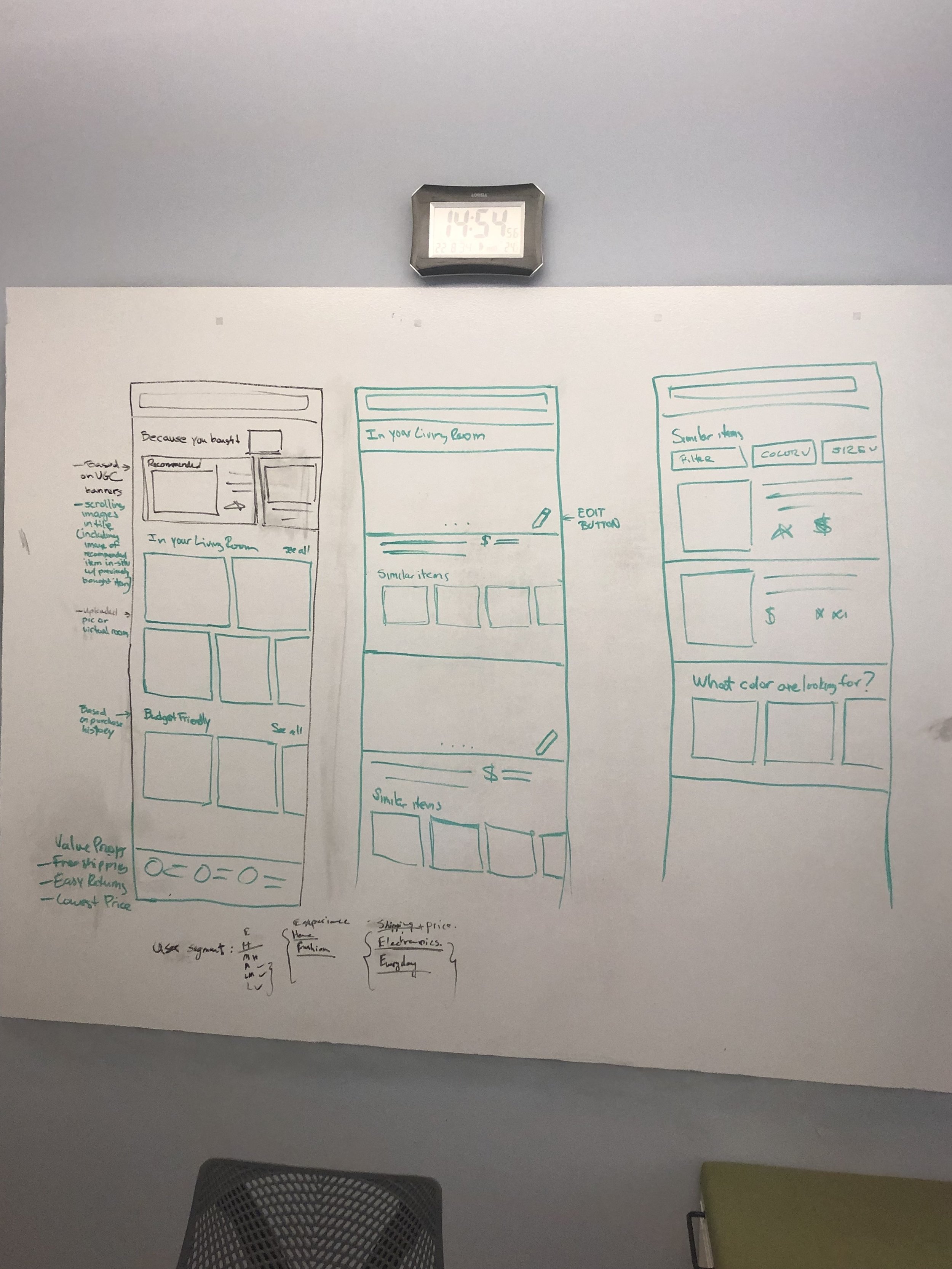
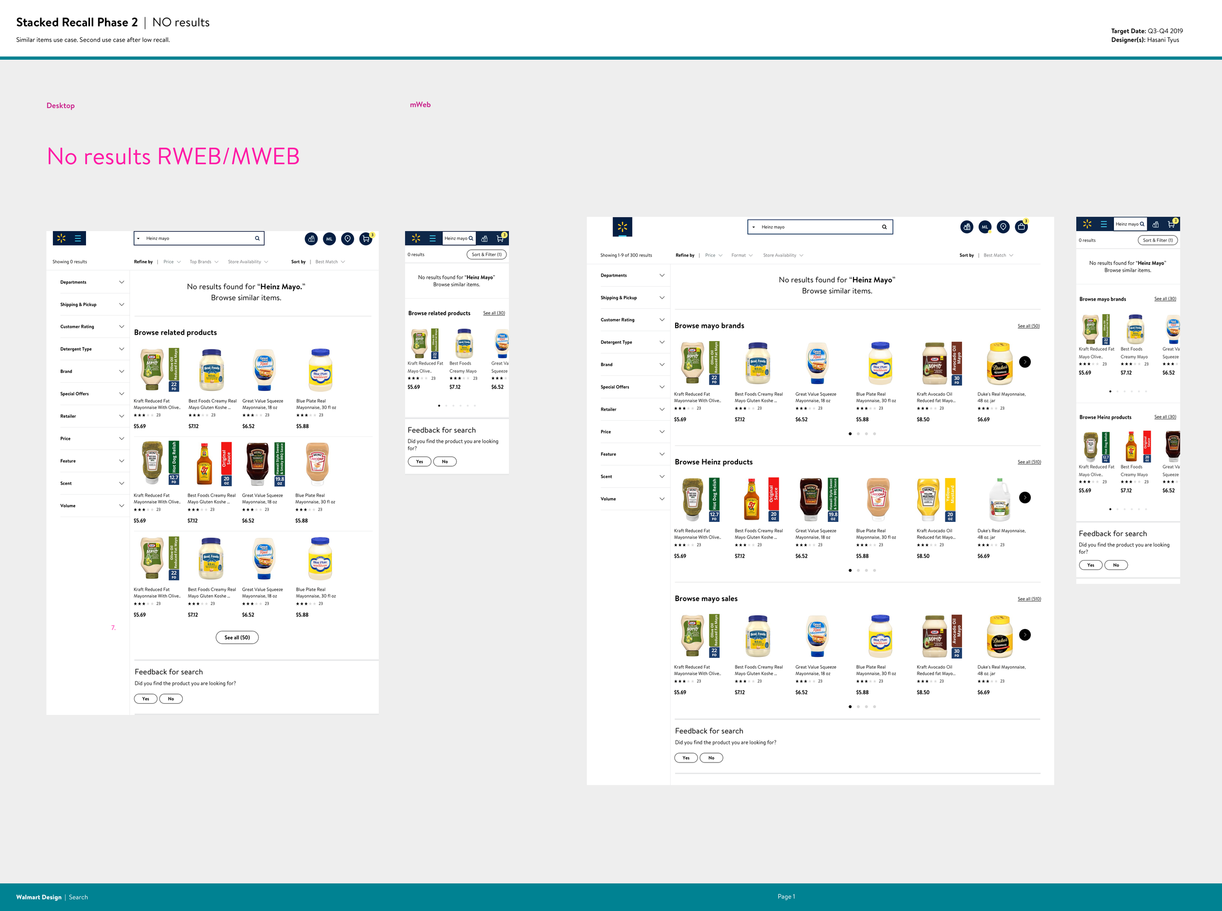
Stacked Recall
Initially proposed by product and validated through our storyboard and co-creation studies, category disambiguation aka “stacked recall” was developed in parallel to the larger modular search effort. The goal was to make decision making and cross selling faster and simpler, by organizing products on a search results page into “shelves” specific to a customers search terms.
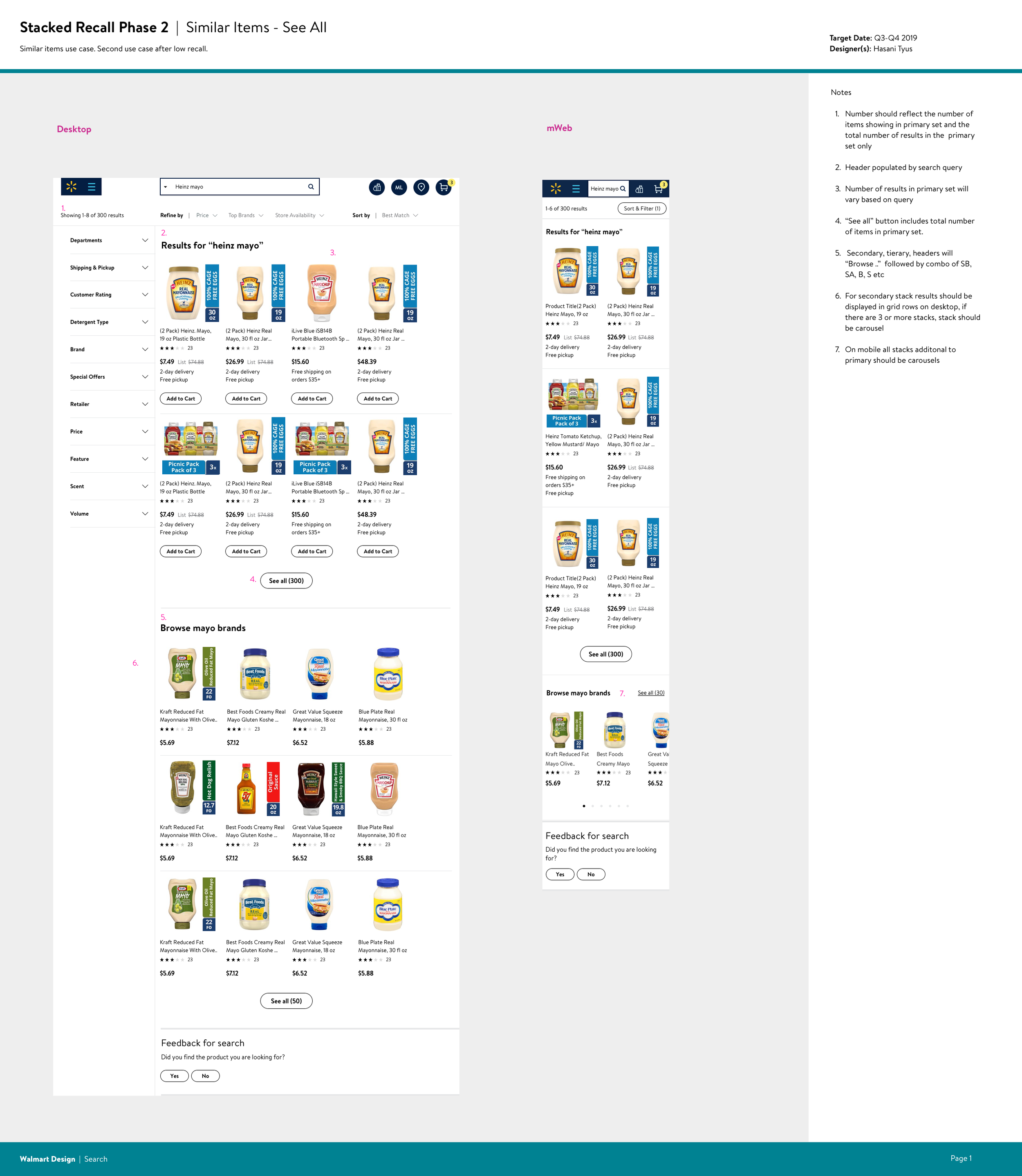
I worked with product and engineering to brainstorm use cases in which stacked recall would be the most useful. Referencing VOC and traffic data we settled on 4 primary use cases:
1. We understand the intent/query and a lot of products match (LARGE ASSORTMENT)
Traffic 60%
Customer & Business goals
Show precise results to customers and give them tools to narrow down choices
2. We understand the intent/query and a few products match (LOW ASSORTMENT)
Traffic 10%
Customer & Business goals
Show precise results and upsell and cross-sell when possible
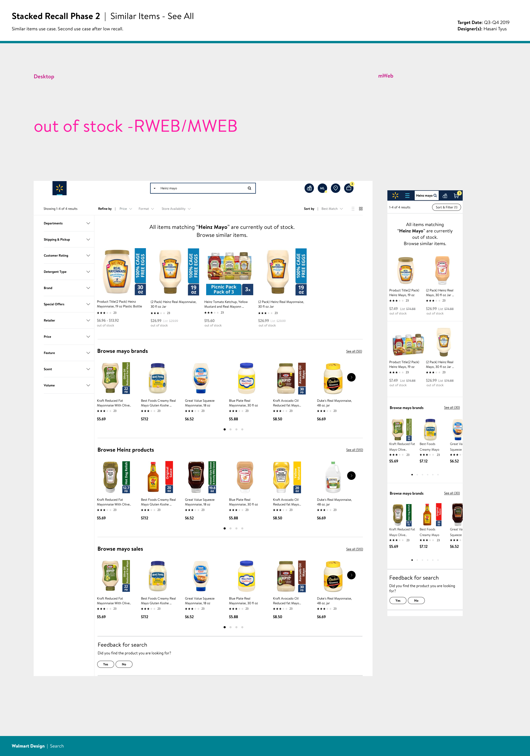
3. We understand the intent/query and no products match (NO ASSORTMENT)
Traffic 10%
Customer & Business goals
Show alternate options and/or inform when products will be available again – either we don’t have it or its out of stock
4. We have low confidence on the intent/query (DISAMB)
Traffic y%
Customer & Business goals
Engage the customer and provide a variety of options
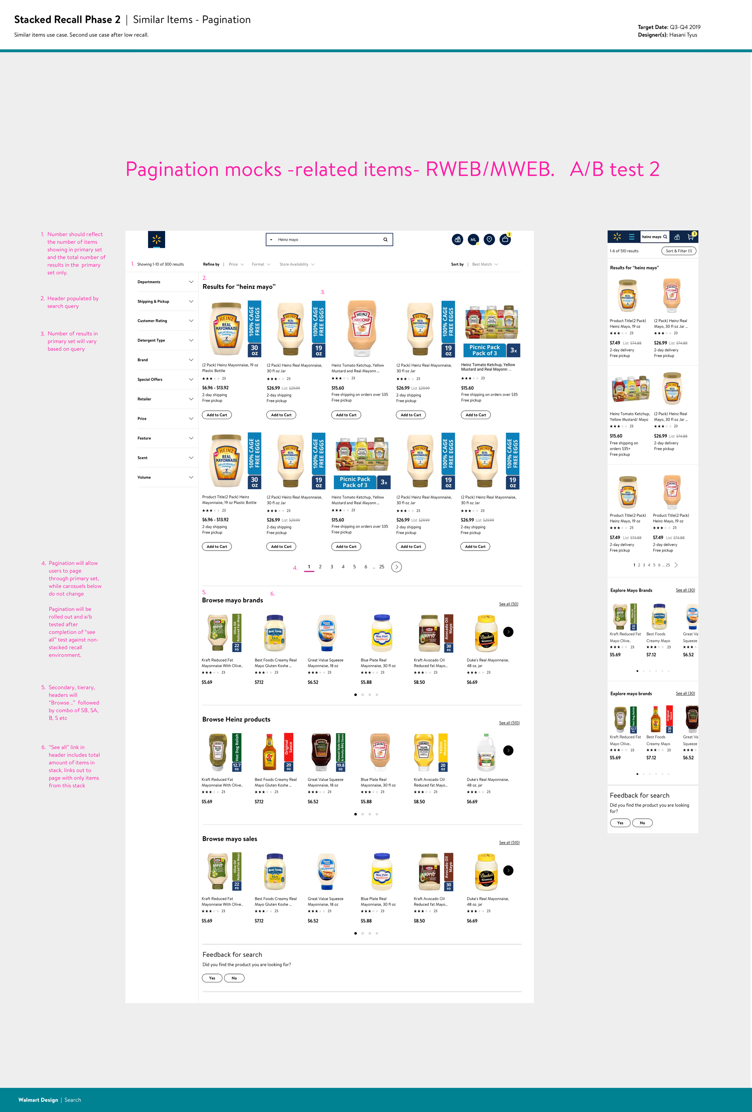
Within each use case I iterated on designs that would align with customer and business goals. I sourced data from the analytics team regarding customer behavior that helped inform design decisions. What percentage of customers navigate to a second page of search results, what number of products typically result in click thru or conversion and what platform customers use most often when they convert - all influenced the final design.
Some of the top considerations that needed to be addressed were how many items would appear per page, how many stacks would appear per query, the use of pagination vs “see all” links, etc. After coming to some design decisions informed by data and constraints, we began by A/B testing a small percentage of the low assortment use case against the existing experience. The results were positive, resulting in an increase in item click thru.
This led to continued development on other use cases and to stacked recall being picked up across the organization. I consulted with team leads across GM (general merchandise), grocery, and the Walmart app to implement stacked recalled experiences.
By March 2021 stacked recall was implemented on 10% of GM queries. Based on engagement metrics gathered from March - April 2021, stacked recall generated an additional 1% in revenue due to related items and accounted for 19.10% add to carts and 5.27% order conversions within consumables.
Personalization
Early voice of customer data showed that search results not being tailored to customer preferences was a major painpoint. This and business objectives to cross sell items led to the development of a search experience that was personalized to our users. Working hand in hand with product and engineering partners, I developed two modules Customers ultimately purchased and You may also like.
Customers ultimately purchased was designed to give returning customers who searched for a product personalized results and generic results for all other customers. The module would take users current query and relevant queries from the last 3 days to provide recommendations. The module placed at the bottom of the the results page to improve engagement for users who scrolled past their primary search results, indicating they didn’t see what they wanted.
Customers ultimately purchased
You may also like was designed to serve personalized complementary item recommendations for returning customers by using previously purchased item boosting, category affinity-based item reranking and brand affinity-based product selection. For high frequency purchases, customers are able to build baskets faster, reducing clicks to ATC resulting in improved conversion and GMV.
In designing this module I wanted to be able to provide contextual recommendations without pushing search results out of view or causing the user to lose their place on the page. I iterated on a design that reveals complementary items behind an item after said item is added to cart. Due to engineering constraints this design was rolled out only on native app for mvp.
“You may also like” module animation
Since the launch of the personalization mvp ATC rates rose and overall GMV went up 20bps.
Shop by
After being chosen in the storyboard study to move forward, I continued to do discovery and visually iterate on the interstitial questions within the plp or “shop by” as we called it. The goal was to help guide and educate customers to find what they want faster by asking them query specific questions that would function as filters for their search results.
“Shop by” visual exploration