
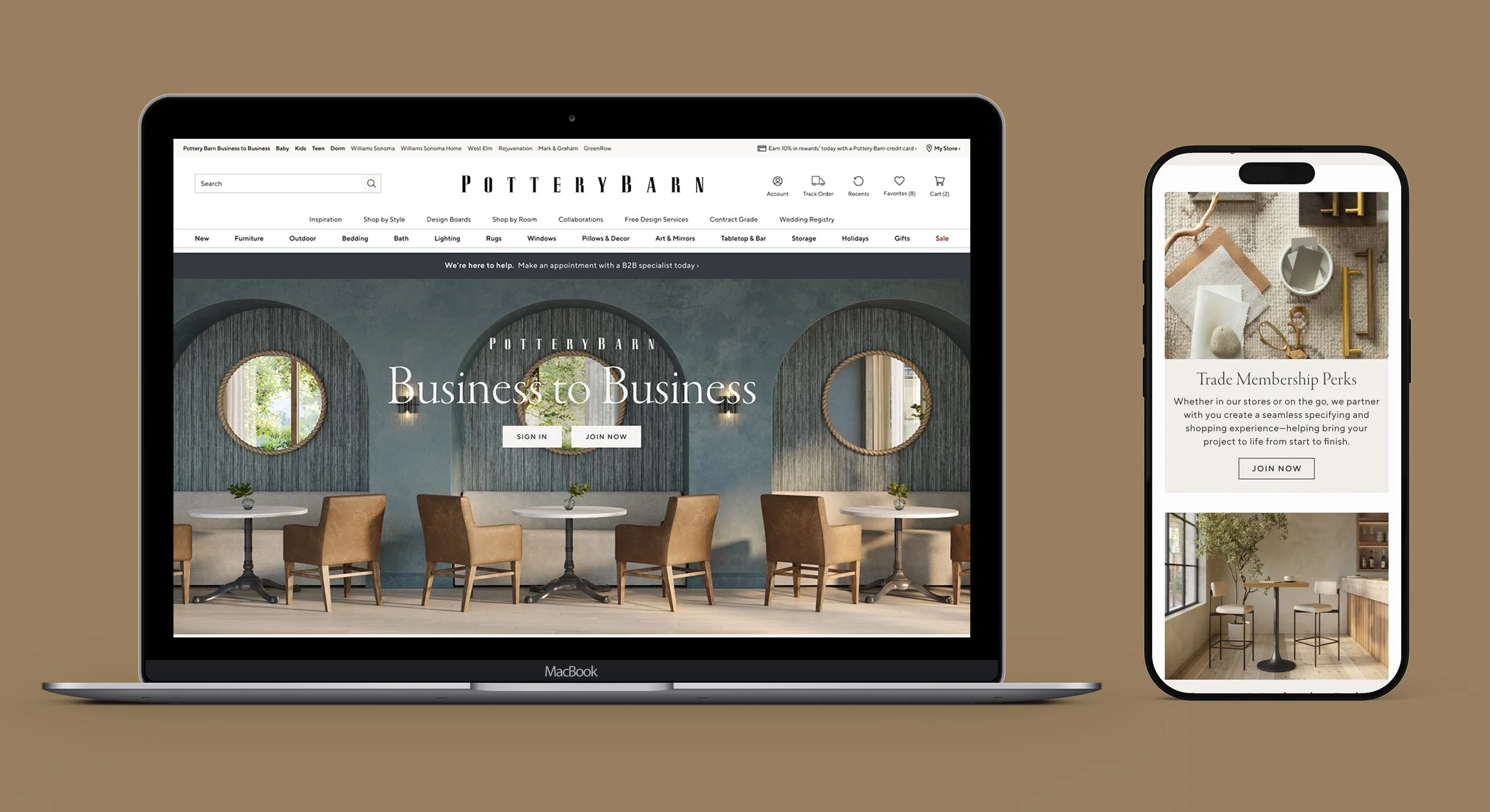
Pottery Barn B2B
A ground-up redesign of the Trade & Contract landing page, from information architecture through
final visual execution, for one of Williams Sonoma’s flagship brands. Giving Pottery Barn’s B2B program
a front door worthy of the brand.
Role: Lead Designer
Research through visual execution
Team: Solo designer
Partnering with Head
of UX Research & B2B stakeholders
Scope: B2B landing page Desktop & mobile, responsive
Launch: Live
Across six Williams Sonoma brands
Overview
Pottery Barn’s B2B landing page served as the front door for Trade and Contract members , but the existing experience wasn’t reflecting the quality of the program or the brand. I led the end-to-end redesign, from research and IA exploration through final visual execution, partnering closely with the Head of UX Research and B2B stakeholders across Williams Sonoma’s brand family. The redesign launched across six brands and drove measurable gains in engagement within the first six weeks.
The Problem
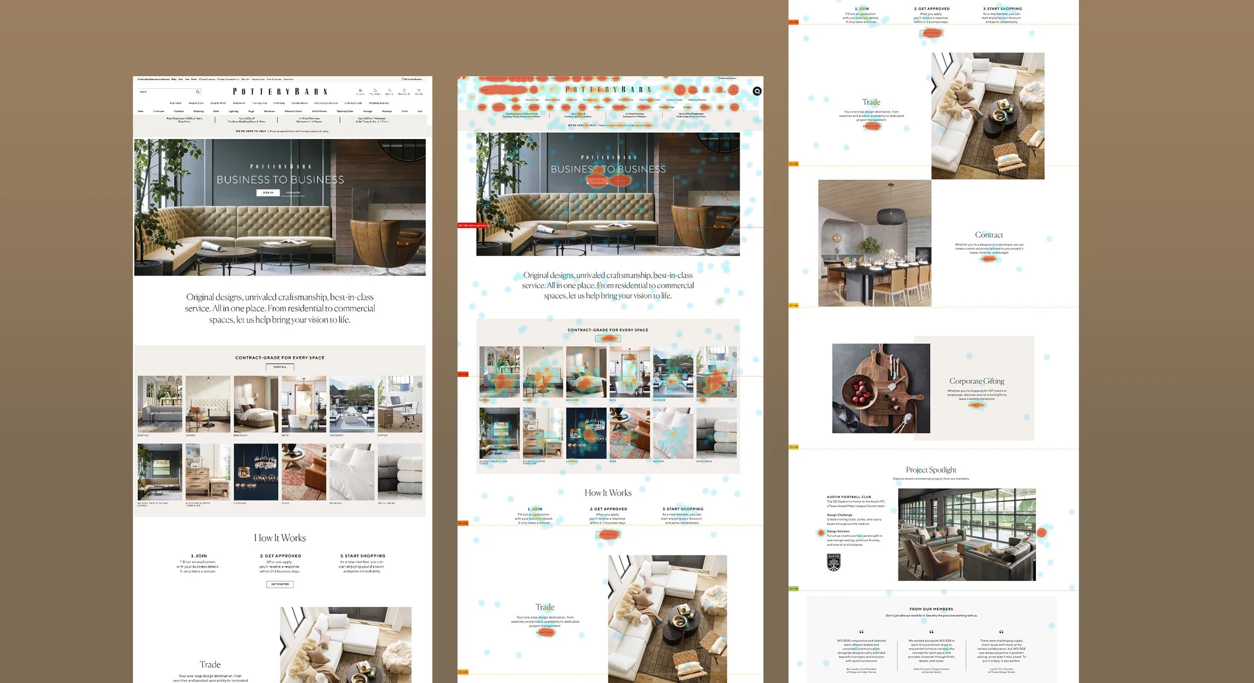
A page users were leaving before they got to what mattered. The original B2B landing page was long, sparse, and text-heavy — Trade, Contract, and Corporate Gifting were each relegated to isolated, low-visual sections well past the fold. Heatmap data confirmed what the structure suggested: engagement was concentrated almost entirely at the top of the page and dropped off sharply from there. Membership benefits weren’t clearly communicated, and the page’s visual tone didn’t match the caliber of Pottery Barn’s brand or its contract-grade product offering. The goal was to rebuild the page so it worked harder, faster , surfacing the right information for both new prospects and existing members earlier, while elevating the visual execution to feel as considered as the products it represented.
Previous landing page Heatmap & Scroll Data
Research & Discovery
Understanding what Trade and Contract members actually need. I audited the existing B2B experiences across Williams Sonoma’s brand family and benchmarked against competitor B2B and trade programs to understand industry patterns and gaps. I paired this with synthesized research and stakeholder takeaways from the Head of UX Research, who had conducted qualitative interviews with existing B2B members.
Three Key Insights
Trade and Contract members have different needs and intents, and needed clearer, more distinct paths through the page.
Corporate Gifting, while available to all members rather than a membership tier itself, needed more visibility than the old page gave it.
The page needed to front-load its most valuable content. The original structure buried nearly everything that mattered below where users actually scrolled.
Process & Exploration
Solving the structure before solving the style. Early wireframe exploration focused on information architecture, testing different ways to organize a genuinely dense set of content (two member types, nine brands, nine product categories, case studies, FAQs) into a page that felt clear rather than overwhelming. Variations tested different orderings and structures: leading with member benefits versus leading with brand breadth, presenting Trade, Contract, and Corporate Gifting as compact grid modules versus full-bleed stacked sections, and different treatments for surfacing shop categories earlier in the page.
Wireframe Exploration
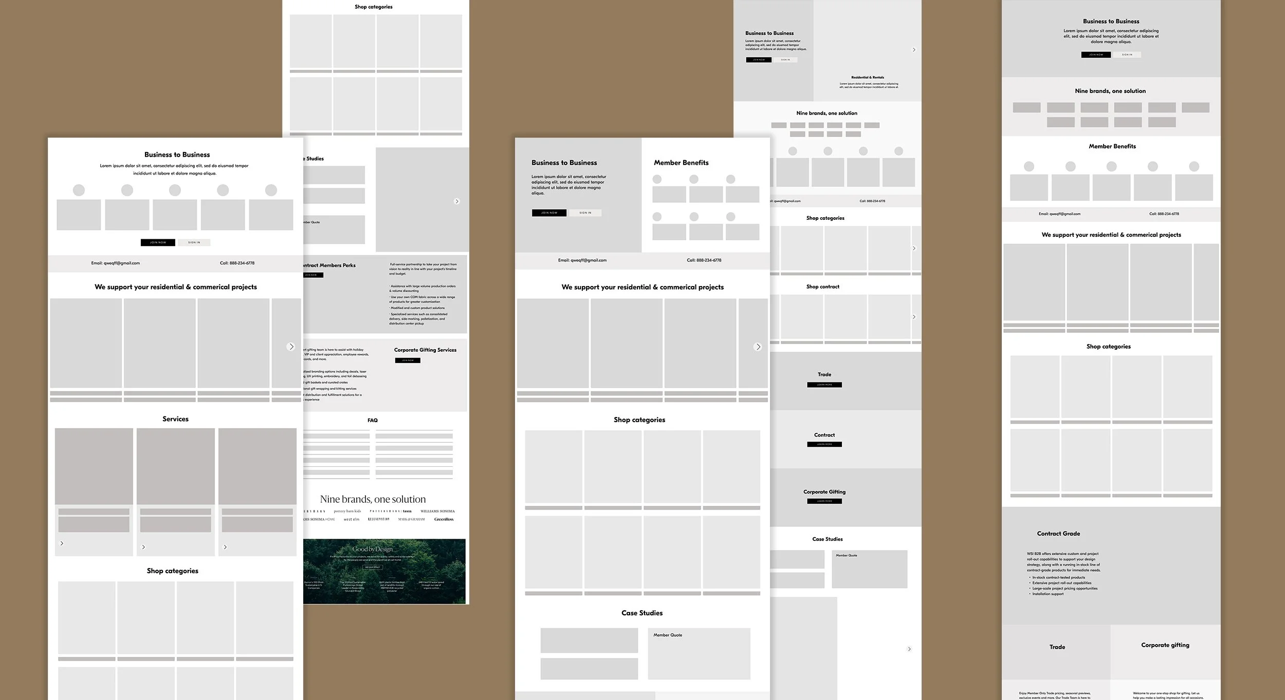
Wireframe Exploration
One early direction used a custom icon set to help quickly signal membership benefits and content types. As the design moved into high fidelity, I moved away from icons in favor of real photography, a more premium, editorial choice that better matched Pottery Barn’s brand voice and gave the page a stronger sense of craft throughout.
High Fidelity Exploration
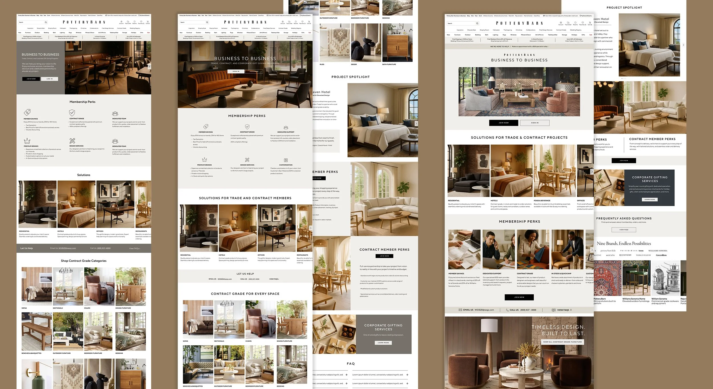
Visual & Craft Decisions
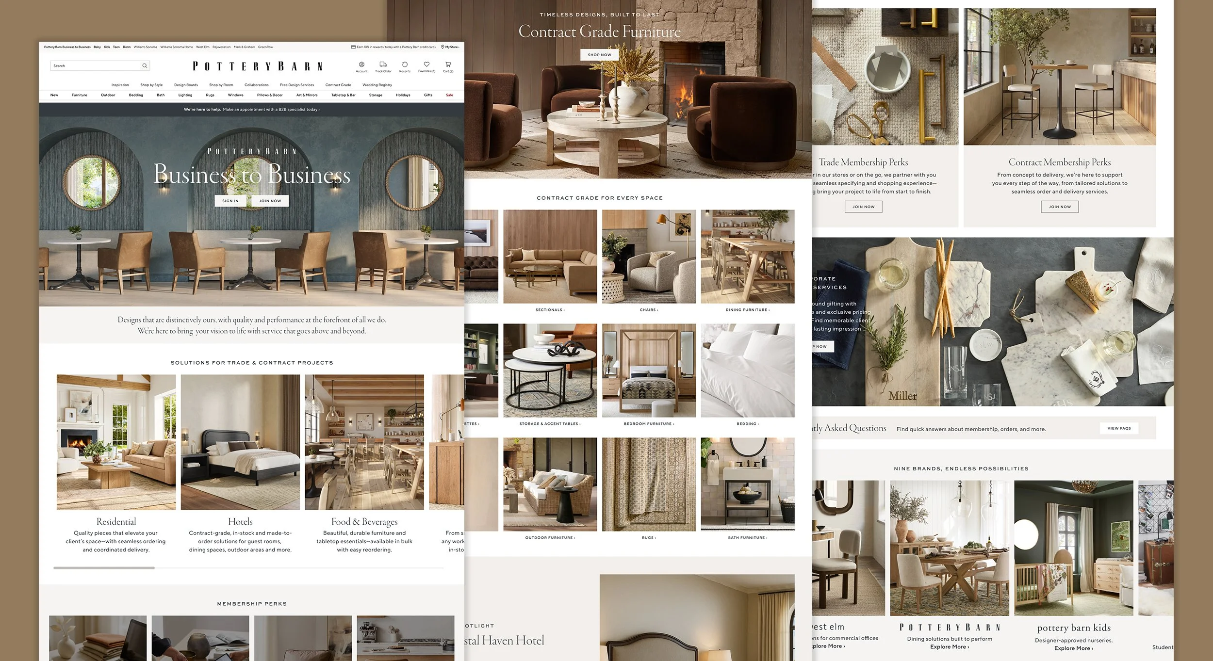
Building a page that feels like the brand. The final design leads with a full-bleed lifestyle hero, paired with tight, confident copy and a clear dual CTA for new and returning members. Directly below, "Solutions for Trade & Contract Projects" surfaces real-world use cases — Residential, Hotels, Food & Beverage, Offices — helping both audiences self-identify early rather than wading through generic copy.
Membership Perks, originally explored with icons, shipped as photography-led cards, pairing lifestyle imagery with
benefit-focused copy for a warmer, more premium feel than the original page. A full-bleed brand moment anchors the middle of the page, and the Contract Grade category grid, Project Spotlight, and Trade, Contract, and Corporate Gifting sections carry the same warm, editorial photography style throughout.
Consistent lighting, materials, and composition reflect Pottery Barn's aesthetic rather than a generic B2B template. I used
AI throughout the process — for early copy exploration, generating brand-appropriate placeholder imagery during design reviews, and producing select final imagery used in the shipped design.
Final Design
Outcome
Six weeks post-launch, across six brands. The redesign launched across six Williams Sonoma brands and showed encouraging engagement gains within the first six weeks. Sign-in, application referral, and shop-path click-through rates improved across the majority of brands. Williams Sonoma in particular saw significant gains in both traffic and revenue penetration.
4 of 6 brands — improved application referral rate
post-launch
+626bps — sign-in CTR increase for Williams Sonoma, the strongest revenue performer
+420bps — revenue penetration gain for Williams Sonoma post-launch
Results weren’t uniformly positive, and that’s part of the story: a few brands saw declines in product discovery where shop content had moved lower on the page, and a CTA misconfiguration on three brands likely suppressed application referral performance. Both are clear, addressable next steps rather than open questions, the kind of clean signal that comes from a well-structured launch.
Reflection / What’s Next
Signed-in personalization within My Account is planned as a future phase, building on the same member-first thinking established in this redesign. The biggest takeaway from this project was how much of the win came from information architecture, getting the priority and structure of a dense page right mattered as much as the visual execution layered on top of it.
The page has continued to evolve post-launch with content and imagery refinements from the broader team, a good sign the foundation was built to support ongoing iteration.