Giving Pottery Barn’s B2B program a front door
worthy of the brand.
A ground-up redesign of the Trade & Contract landing page, from information architecture through final visual execution, for one of Williams Sonoma’s flagship brands.
Overview
Pottery Barn’s B2B landing page served as the front door for Trade and Contract members — but the existing experience wasn’t reflecting the quality of the program or the brand. I led the end-to-end redesign, from research and IA exploration through final visual execution, partnering closely with the Head of UX Research and B2B stakeholders across Williams Sonoma’s brand family. The redesign launched across six brands and drove measurable gains in engagement within the first six weeks.
Audience
This project focused on Walmart’s primary customer segments:
Time Sensitive Busy Families
Very budget-conscious while also super time-sensitive
Actively seeking new ways to make their $ and minute go further
Care about trends and brands and seek to project a quality lifestyle
Budget Sensitive
Busy Families Super budget-conscious and cost-focused
Need the lowest prices
Less willing to shop around
Shop discount retailers and OPP product to save money and time
Roles and responsibilities
As a member of the Search and Browse team I worked with 2 fellow designers, 2 design managers, 2 designer researchers, 1 content strategist and 4 product managers on the overall strategy and vision for Finding. I led design efforts in the areas of Search disambiguation aka “stacked recall” and Personalized Search while contributing to other areas of focus including predictive type, filtering and product suggestion.
Process
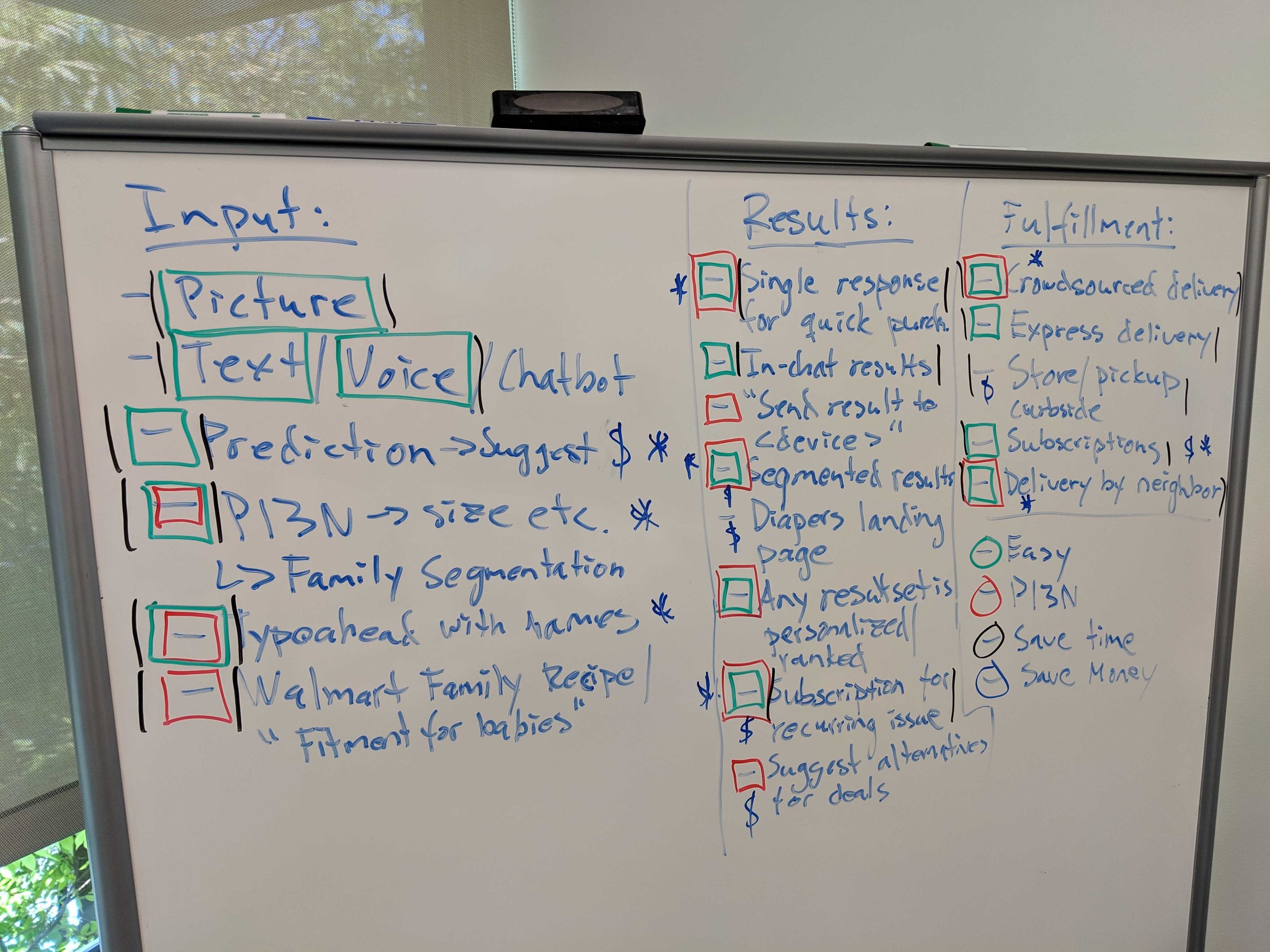
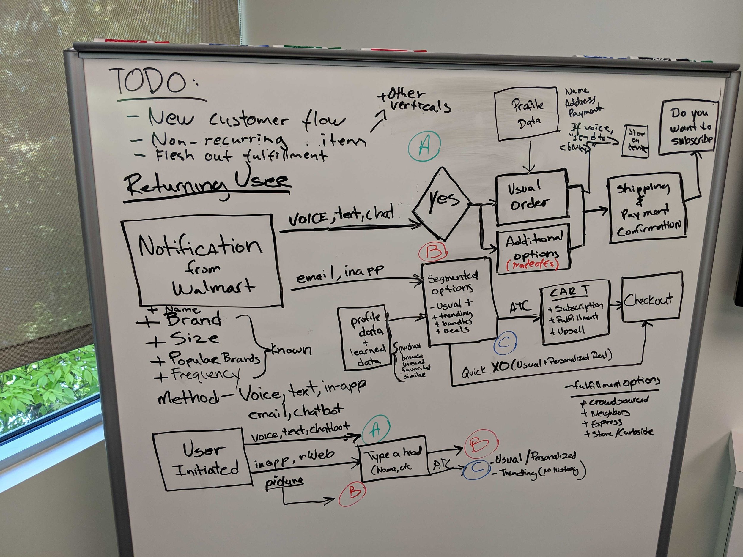
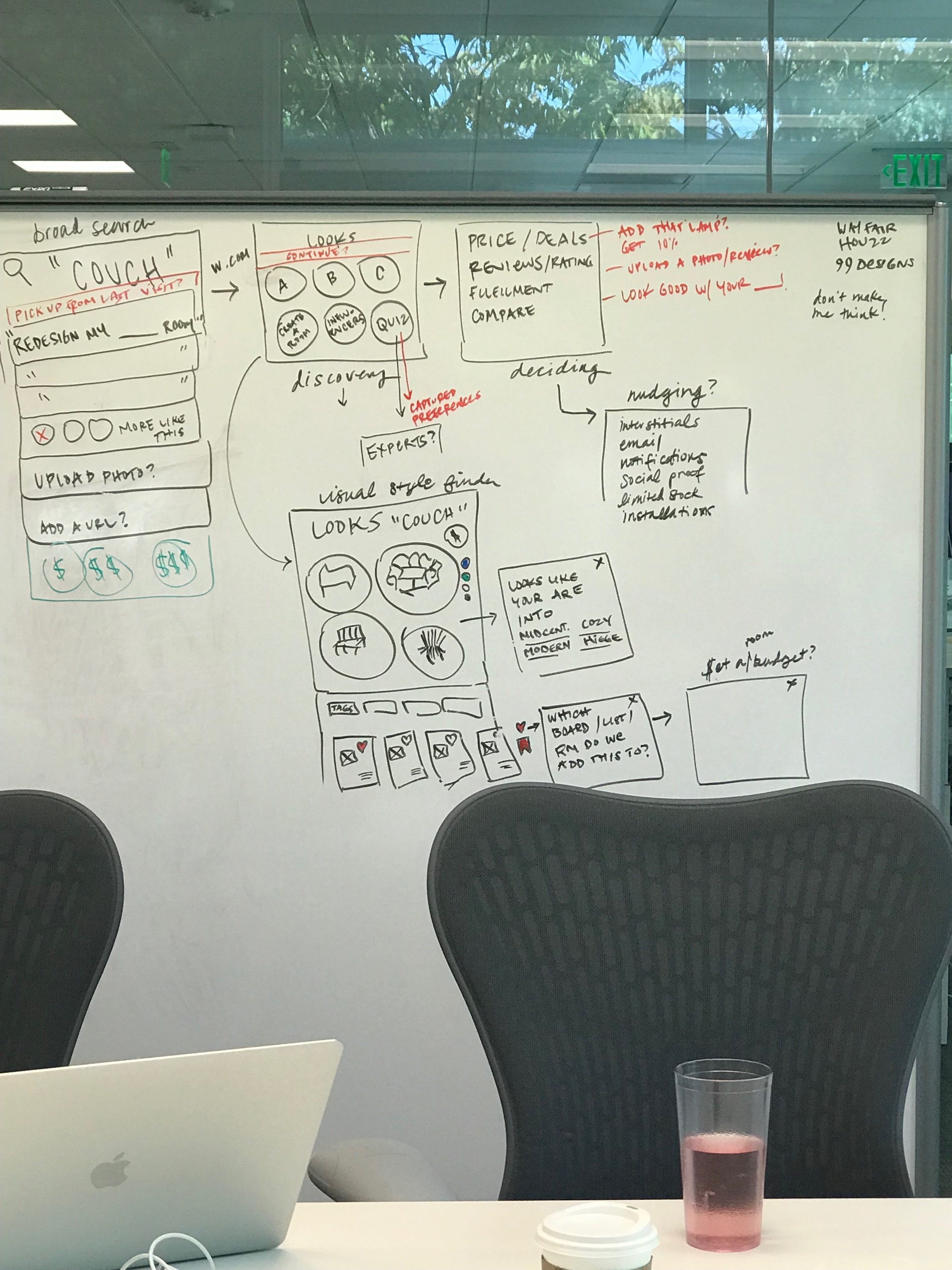
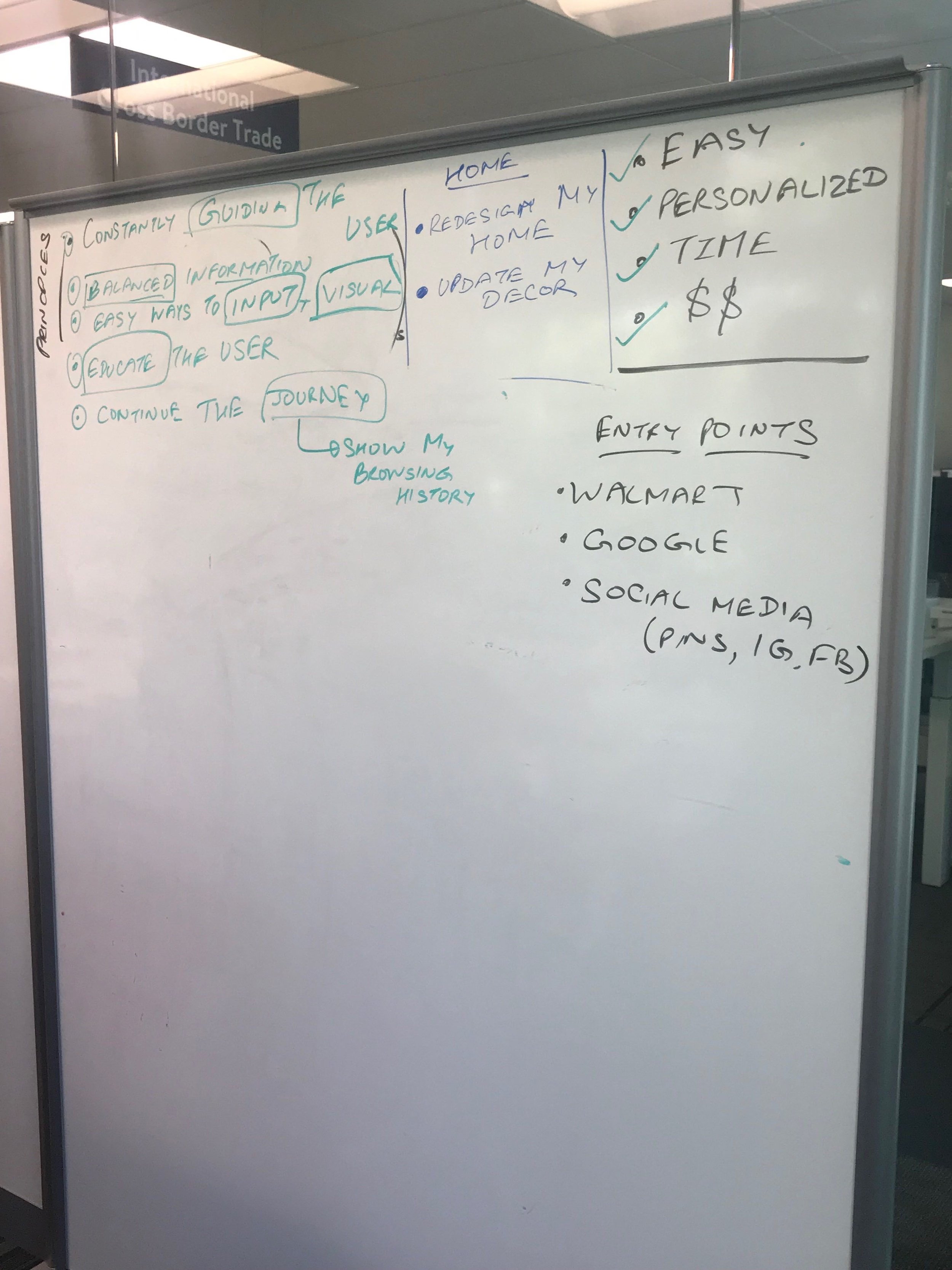
At the onset of the project product leaders triangulated data from VOC (voice of customer), verticals and Search BE to better understand the problem. We then began having cross-functional brainstorming sessions. The goal of the sessions were to brainstorm ways to create an easy, personalized shopping journey that saves customers time and money. From that session we came away with user journeys and features that we hypothesized would help new and returning users when conducting Broad (general) and narrow(specific) searches.
Following the workshop I worked with our product partners and researcher to test our hypothesis with customers. Referencing the “Top 200k search queries” on Walmart, I selected items that exemplified popular Broad and Narrow searches and created shopping narratives around them, using the features we wanted to test. I converted those narratives into storyboards for our researcher to use to conduct a Storyboard Study.
Our study had 4 primary goals in mind:
Understand which experiences resonate with customers and why
Understand the types of features that users connect to
Identify opportunities for different types of features
Better understand if certain features are more useful in specific situations
Our storyboards put several features in front of our users with category disambiguation “stacked recall” and Smart filter questions as you browse “interstitial filters” proving to resonate the most. With the findings from the storyboard study
we began to move forward with design explorations prioritizing these recommended features.


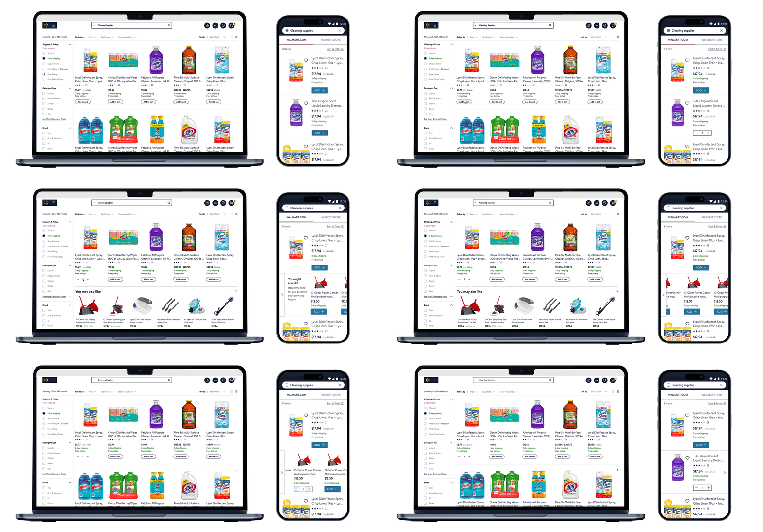
Over the next few months myself and the 2 other members of the search team did a wide range of design explorations of what a search results page could look like, with a focus on the features that came out of the storyboard study. Other features and filtering options also entered into the exploration as we continued to work with our product partners and conferred with multiple category specialists. I explored through multiple lenses, new customers vs return customers, broad searches ( Brand or subject ) vs narrow searches (subject, brand and attribute), High consideration items vs low consideration, and spec driven vs image driven items. I also explored in three different flavors one staying close to the existing Walmart Living Design design language, one venturing far out and another that landed somewhere in-between.
Partnering with our researcher we decided that a co-creation study was the best way to achieve that.
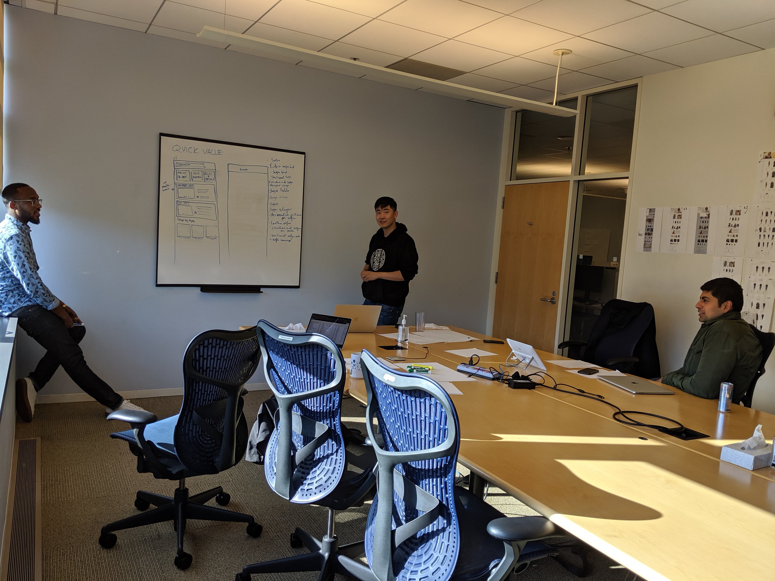
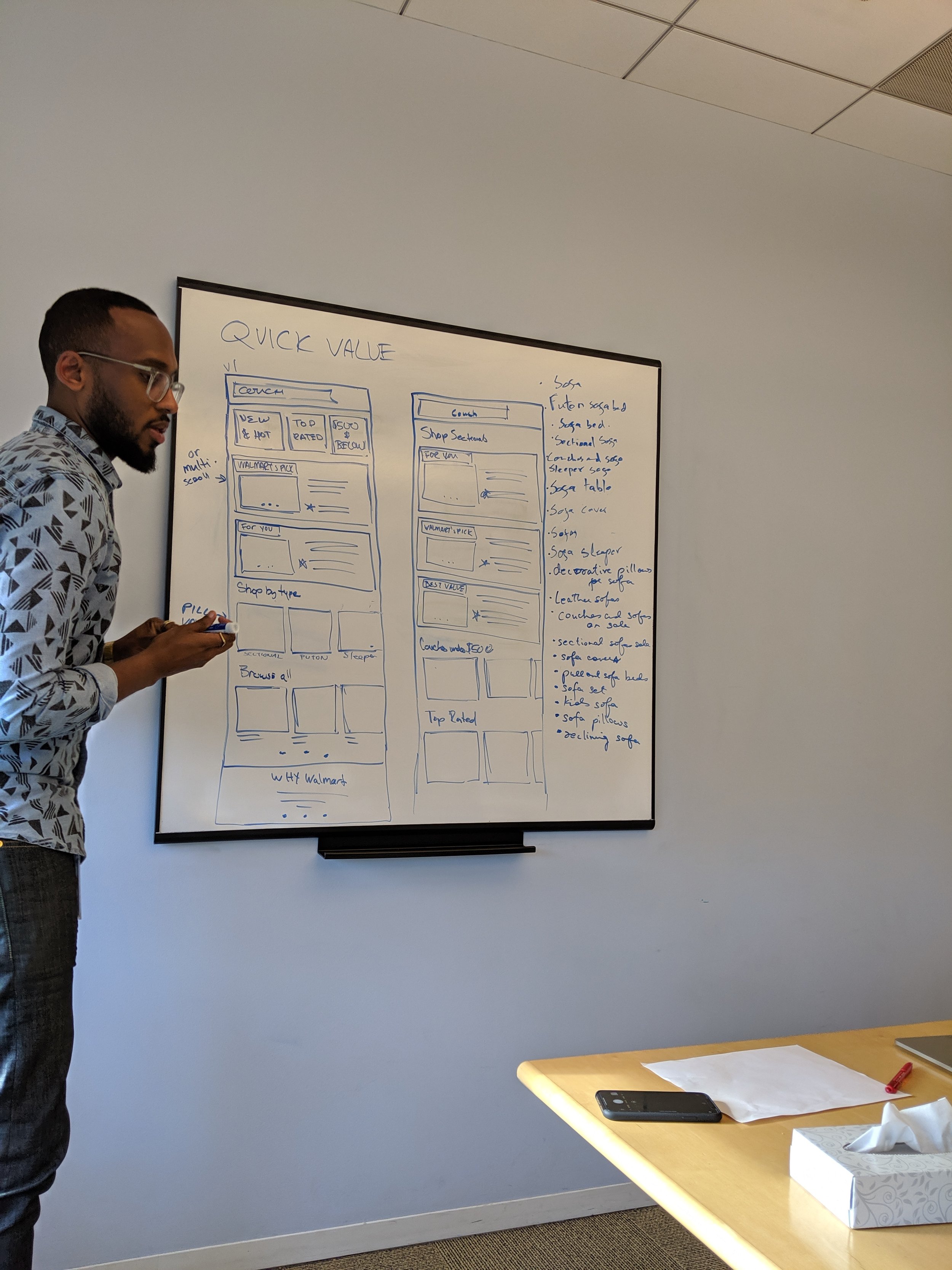
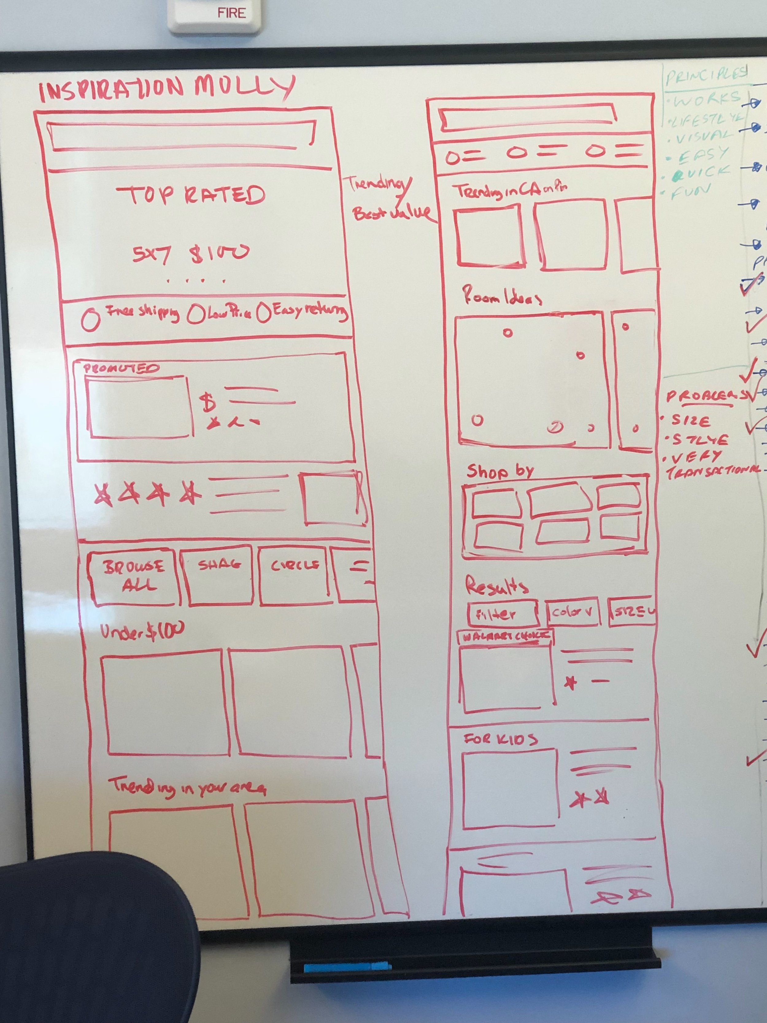
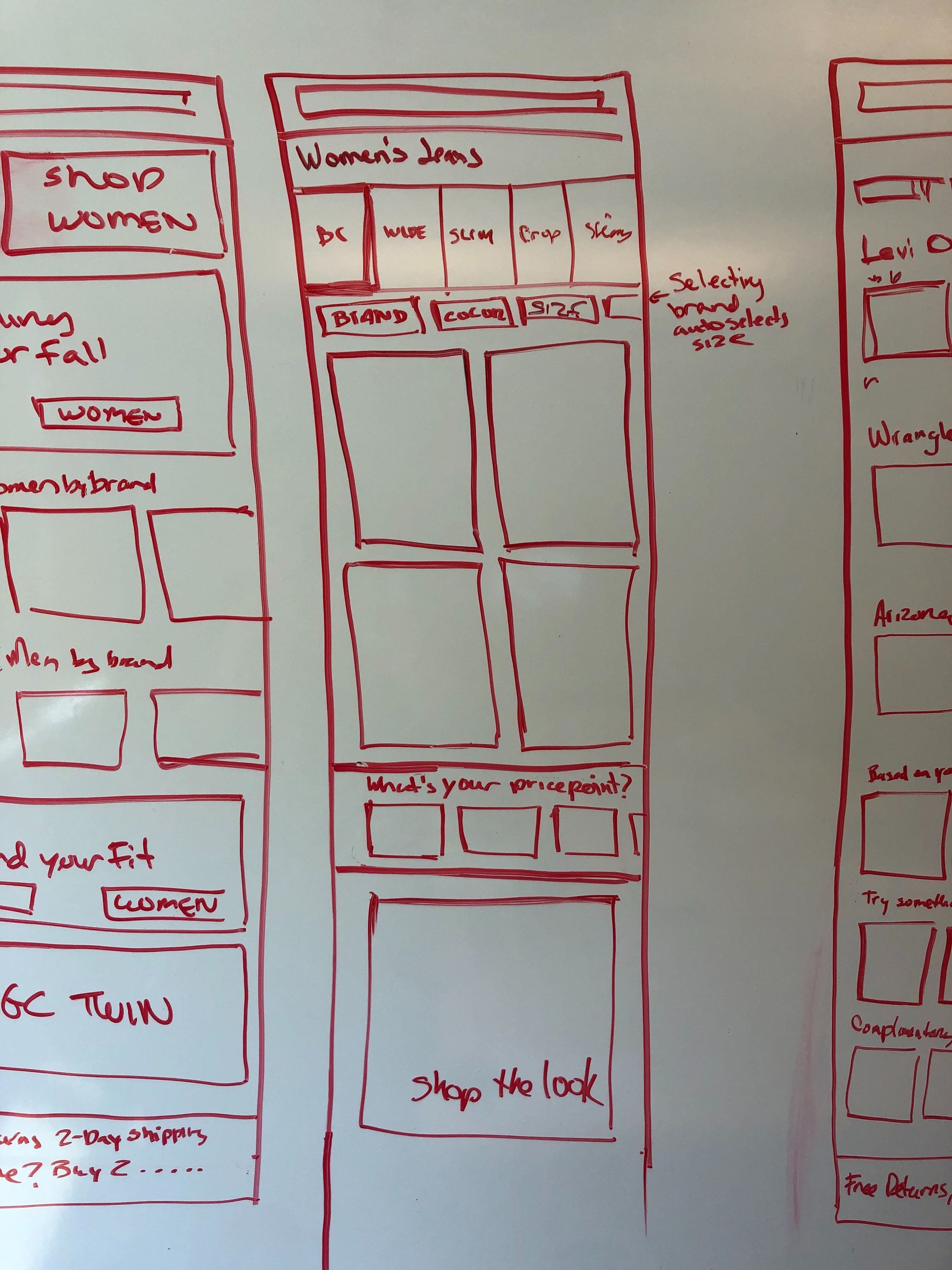
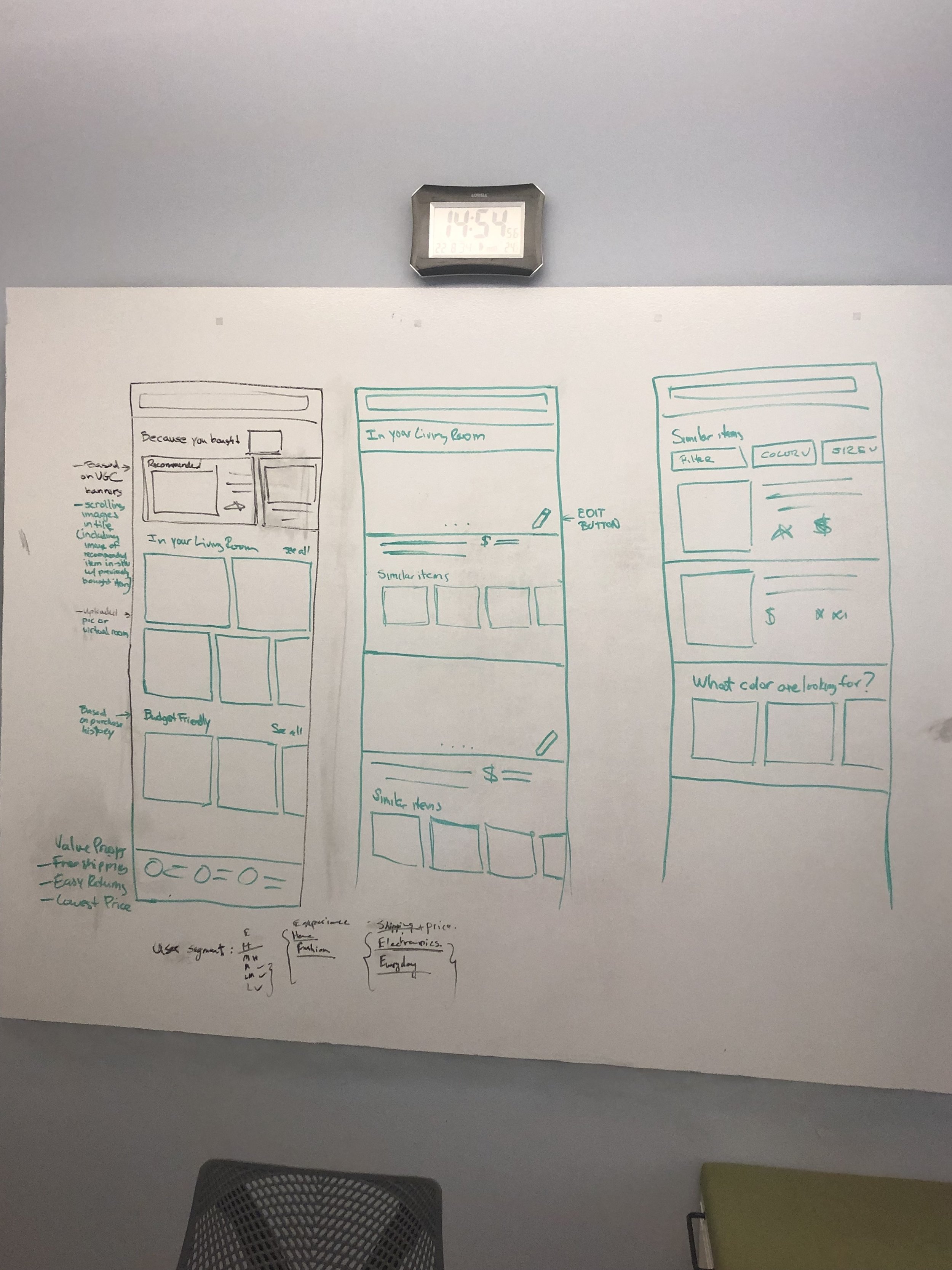
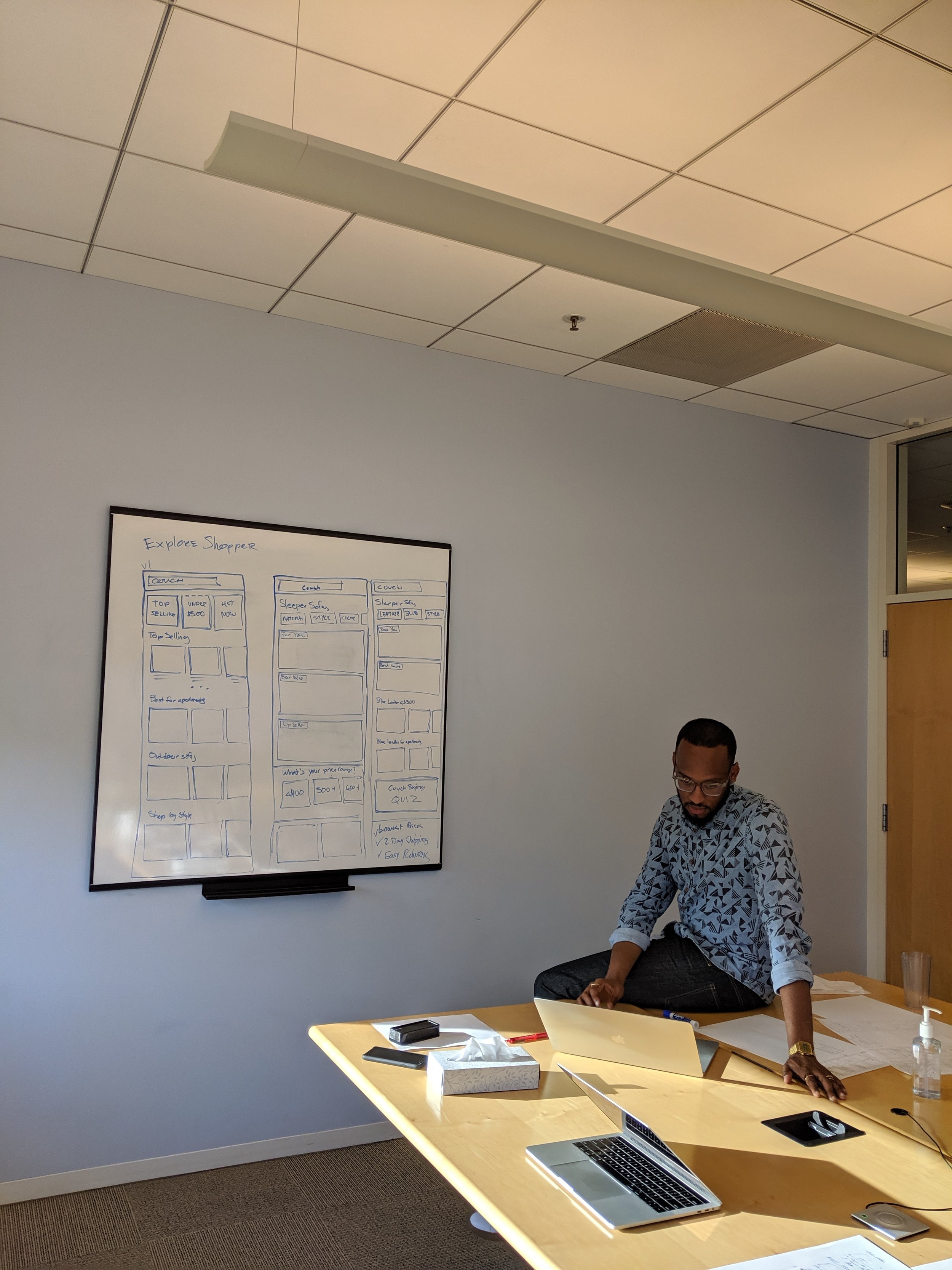
Module Exploration
Co-creation study
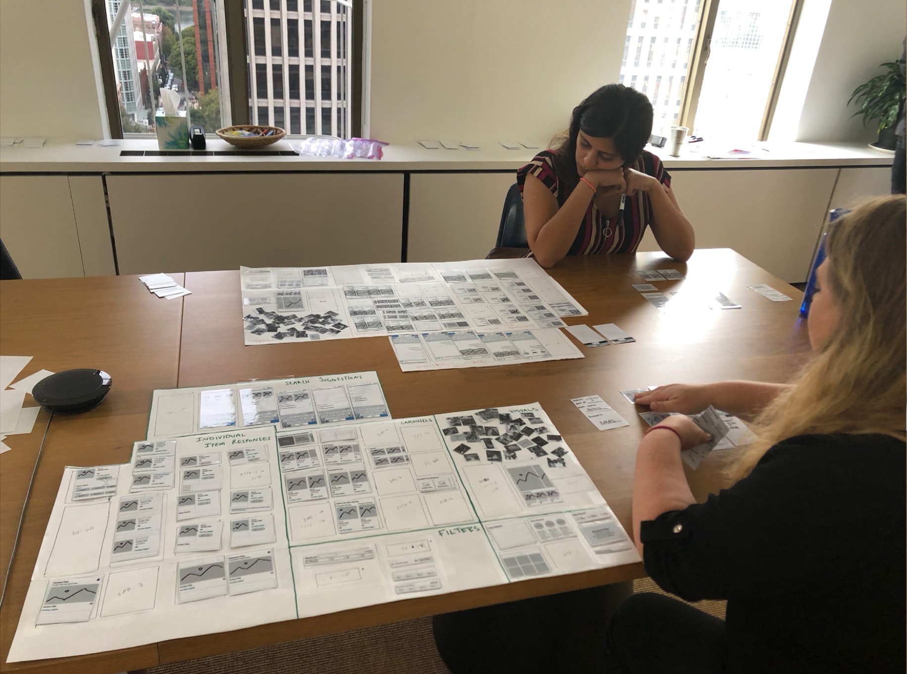
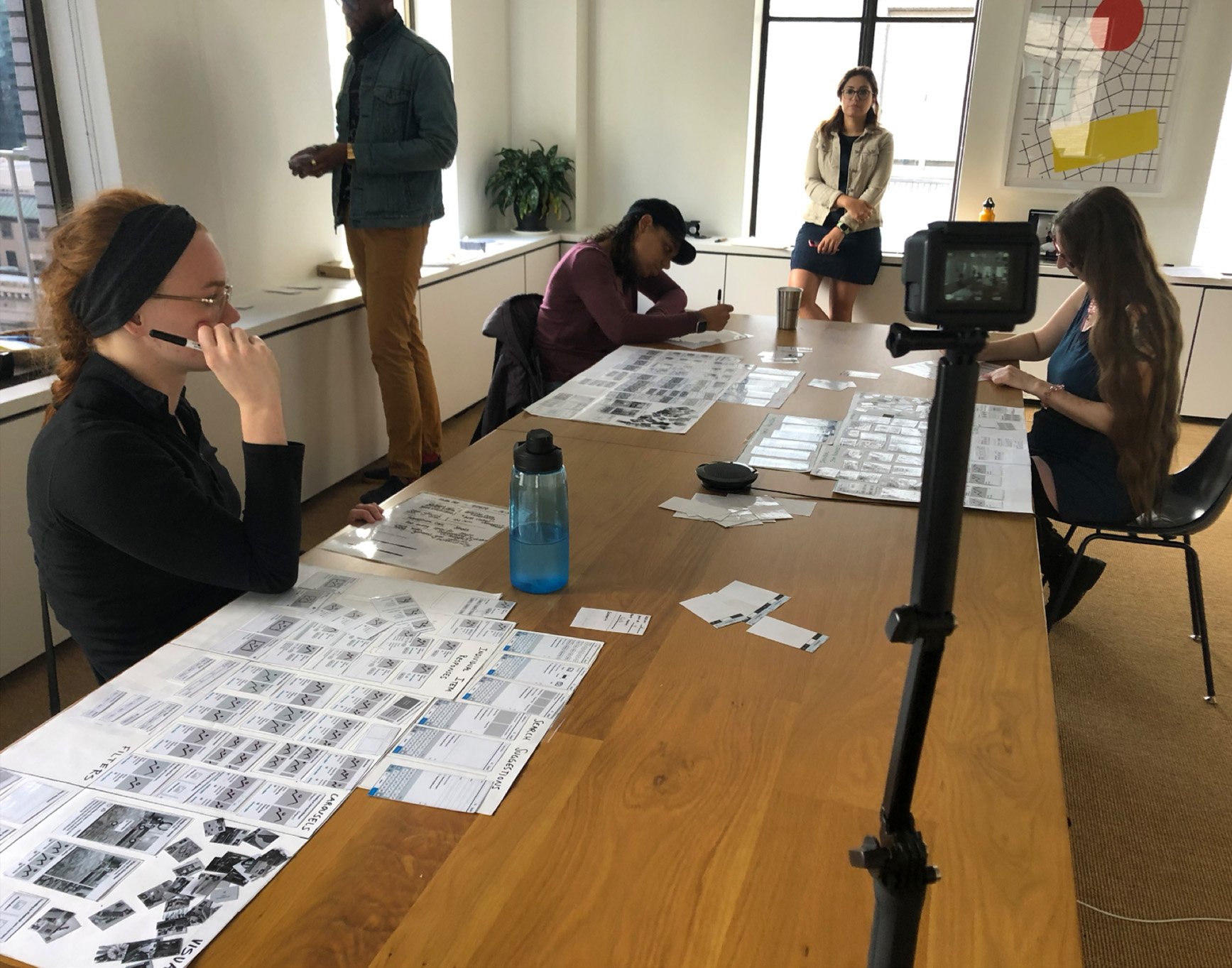
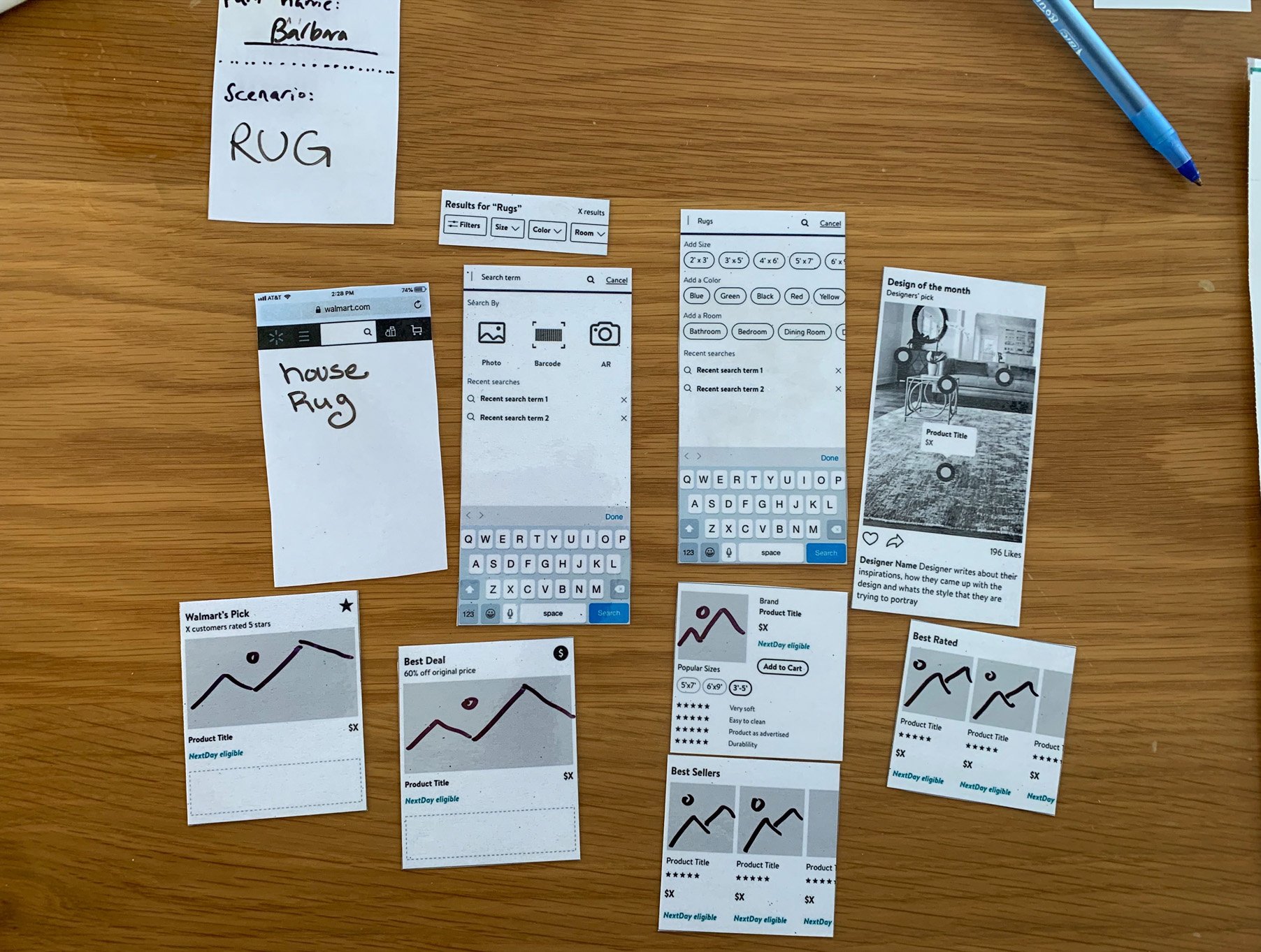
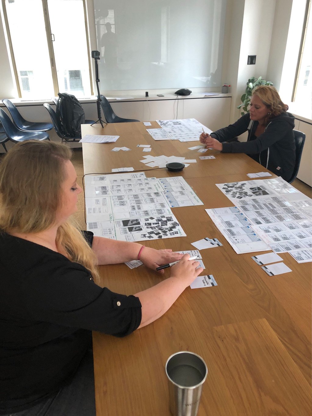
In the study the researcher walked participants through different shopping scenarios that pertain to our customer missions and journeys and asked them to use the modules the design team has already created to build PLP screens that would allow them to complete their task.
Myself and my fellow designers alternated setting up the work space for the study or taking notes in the observation room.
Study Findings
Determined what elements of a search page customer gravitate towards
Understand what module types have flexibility across journeys
Reminded the team of the connectedness of PLP and PDP
Showed that Product Landing pages should vary by:
Product type
Where the customers is in their journey of making a decision
Customer’s shopping motivations
Coming out of the study the design team came together to decide what modules to prioritize to build for mvp.
We choose products that exemplified three primary customer journeys, and referencing the modules that users gravitated
to during the co-creation study selected the modules that best served the shopping experience of each product. We then narrowed the modules based on those that reoccurred across product and that led us to move forward with stacked recall, top picks, shop by and personalization modules.
Stacked Recall
Initially proposed by product and validated through our storyboard and co-creation studies, category disambiguation aka “stacked recall” was developed in parallel to the larger modular search effort. The goal was to make decision making and cross selling faster and simpler, by organizing products on a search results page into “shelves” specific to a customers search terms.